
Warp
January 2017
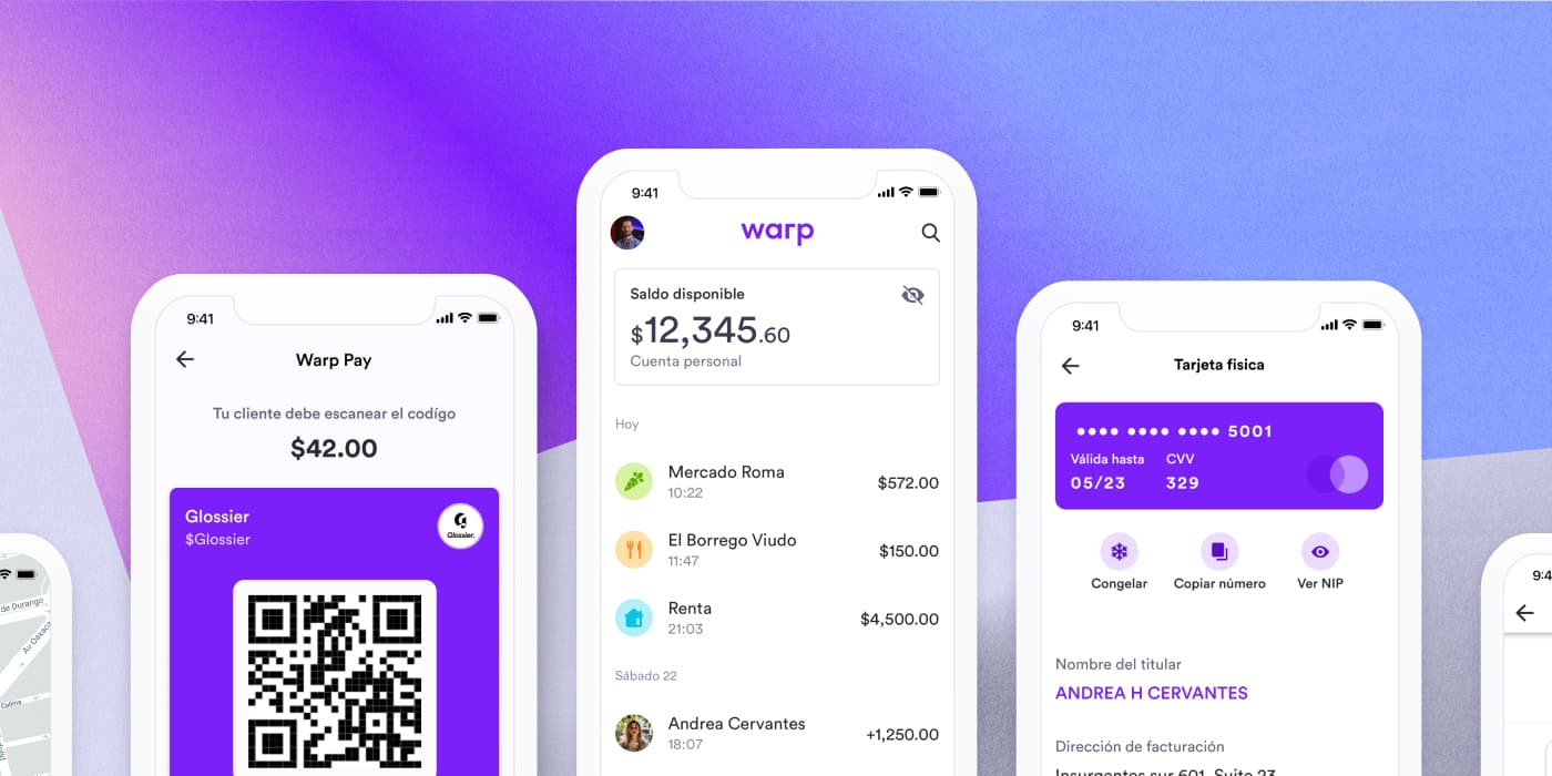
Warp was a Mexican fintech company. We built simple, honest, and transparent financial products to bring prosperity and economic access to millions in the informal economy.
What's Warp?
Warp was a Mexican fintech company building simple, honest financial products. I was a founder and the lead designer on the Warp app. We created this because we wanted to give people financial independence and let them forget the bureaucracy that comes with a normal bank.
Our main challenge was that building financial tools for people who'd never had a bank account required us to fight friction on every screen and turn something intimidating into an obvious action.
Warp design system
I was the only designer, working alongside three engineers building the app. As it grew, keeping the interface consistent — and consistently friendly — got hard. So we built a simplified design system. We started building this library right around the time design systems were becoming a thing, so we drew inspiration from the Airbnb design team and Base Web. We started with colors and typography, and over time expanded it to include components and patterns.
From those primitives the library grew into a full set of components, each documented with its variants and states.
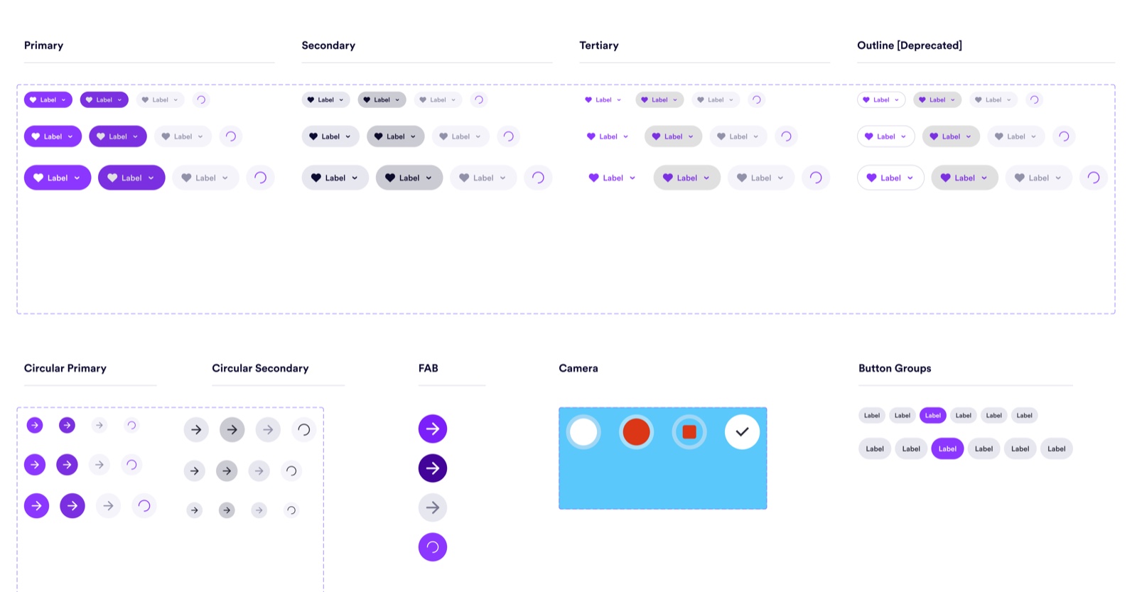
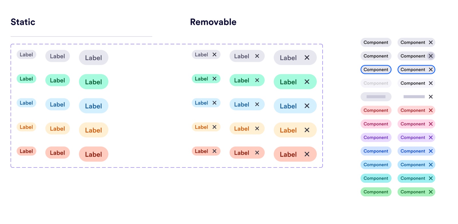
Building the system helped us to assemble new screens very quickly and organize an experience that wasn't entirely cohesive. Because the foundations were deliberately simple, the system wasn't locked to one surface — the same primitives and components carried across iOS, web, and even print.
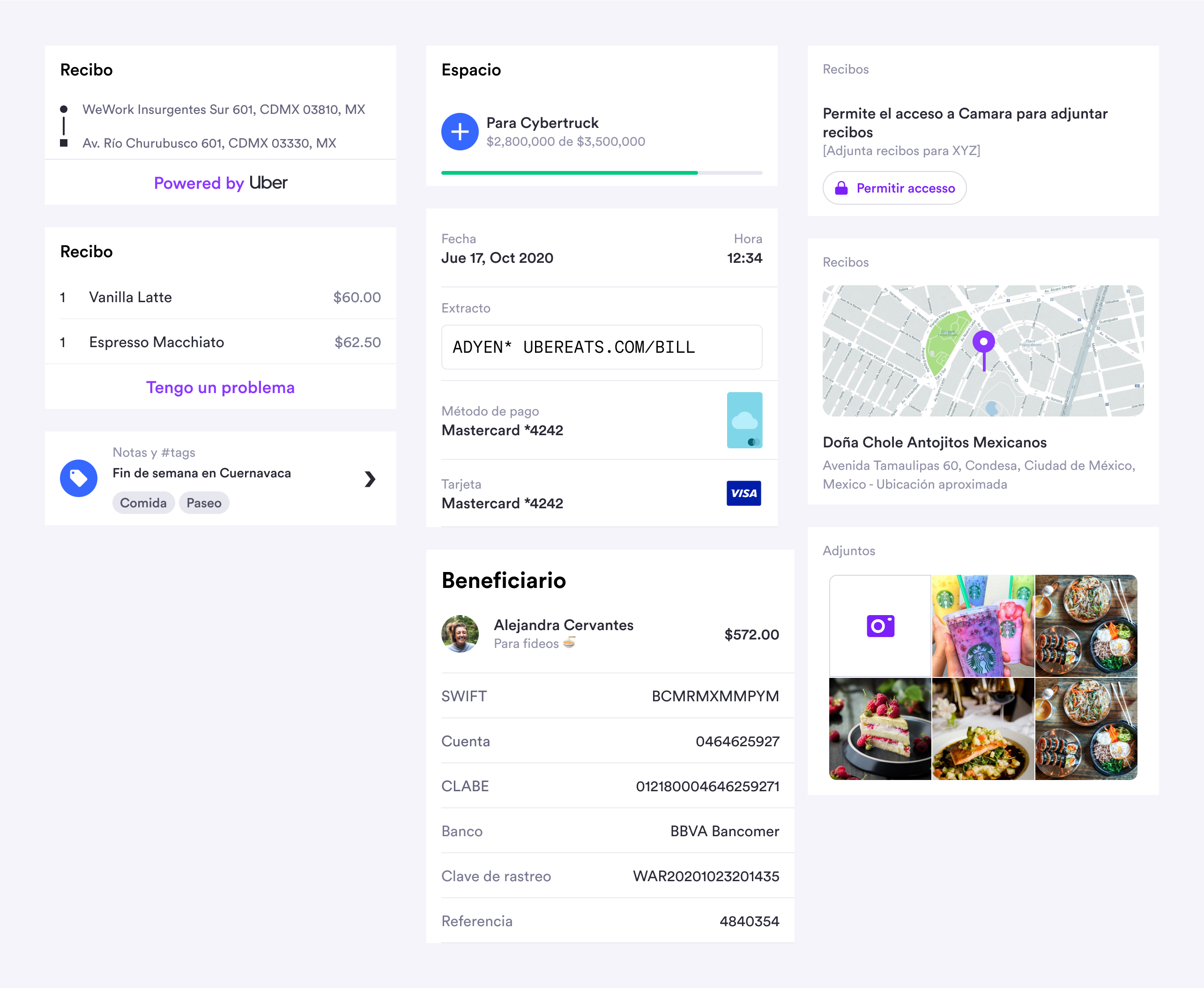
With this set of components we developed patterns across the app that established clear structures and affordances that were familiar to the user.
Examples of this are our transaction rows, which we built to be placed in whatever way we needed them.
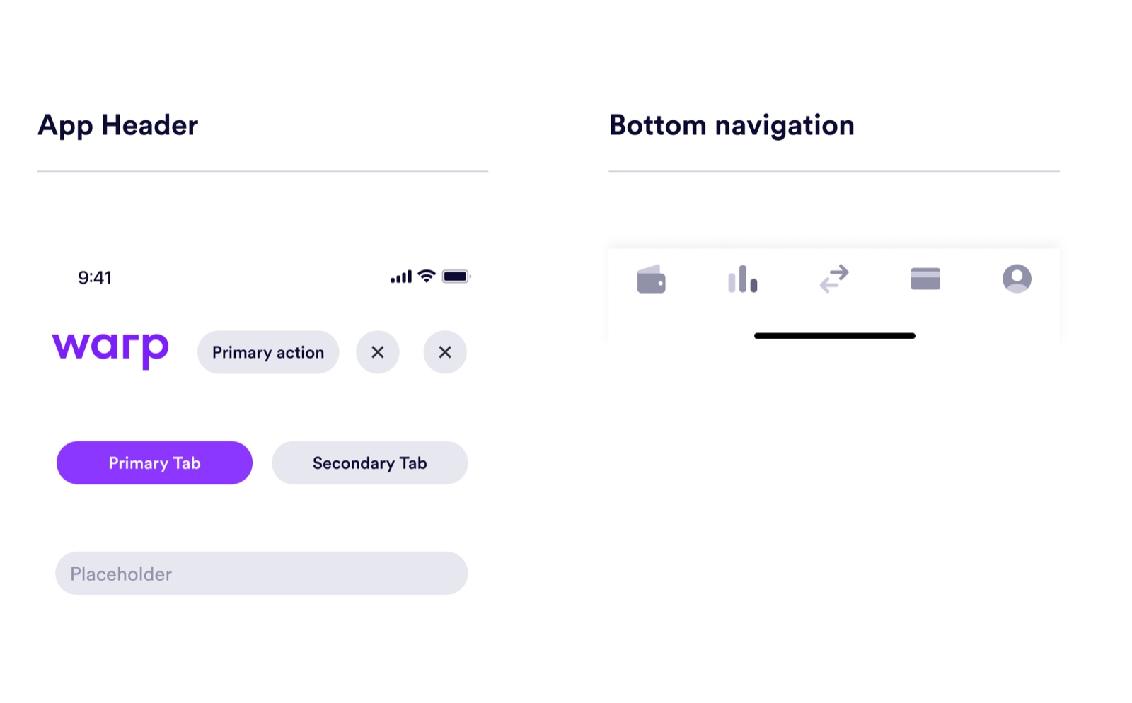
Or the shared navigation shell — app header and bottom navigation — that kept navigation consistent across the app.
Sign up and onboarding
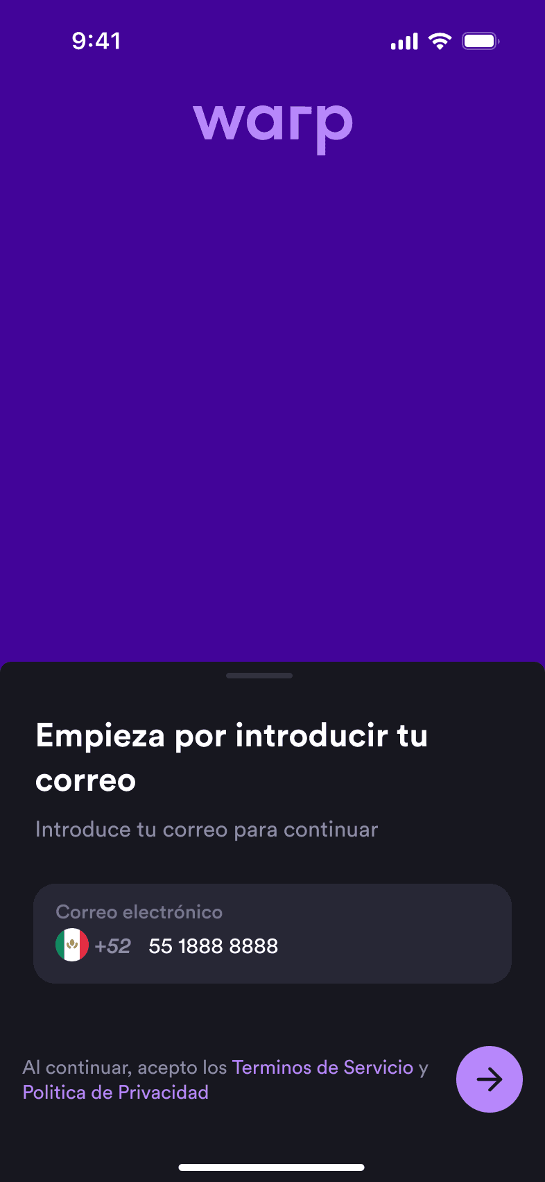
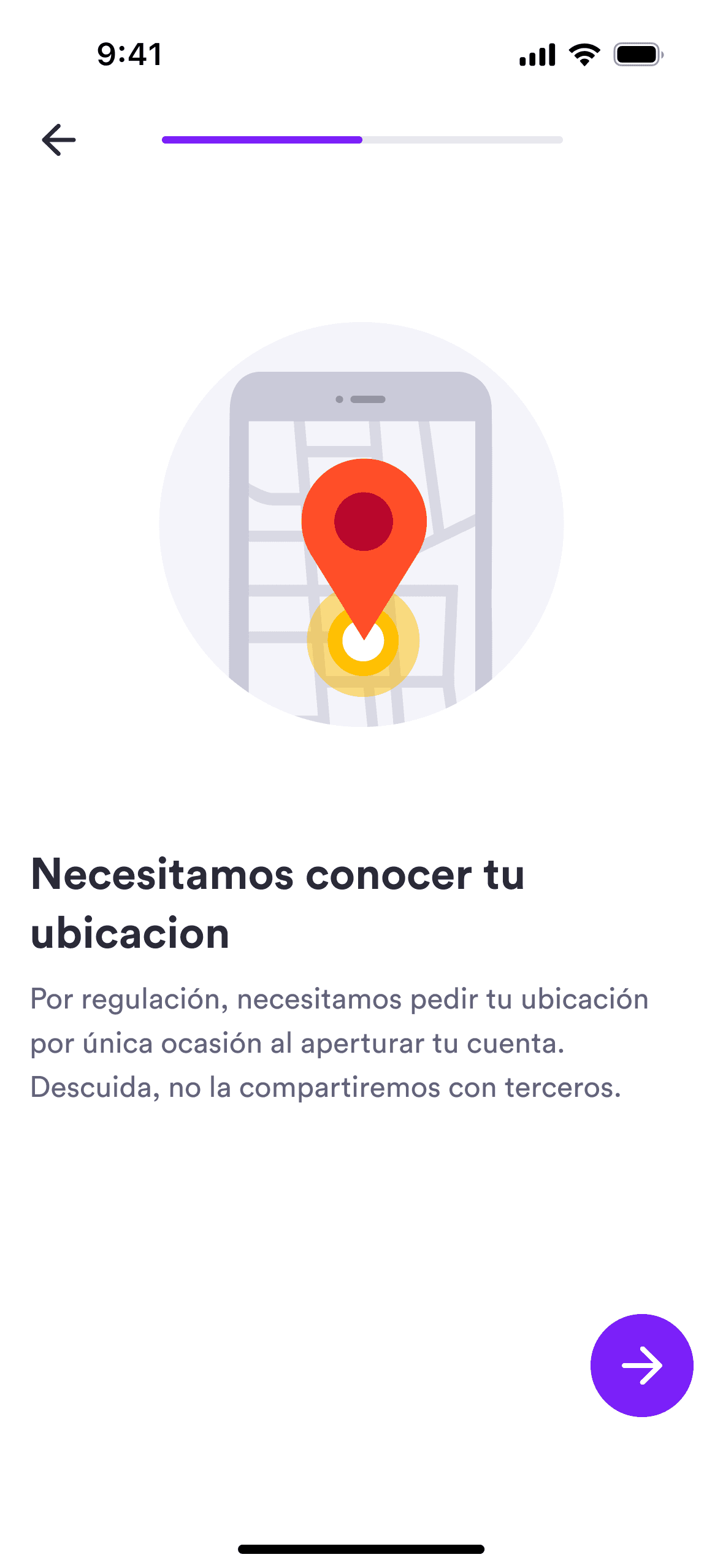
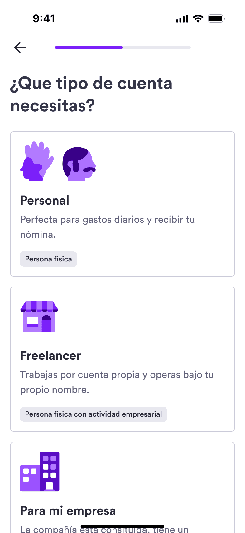
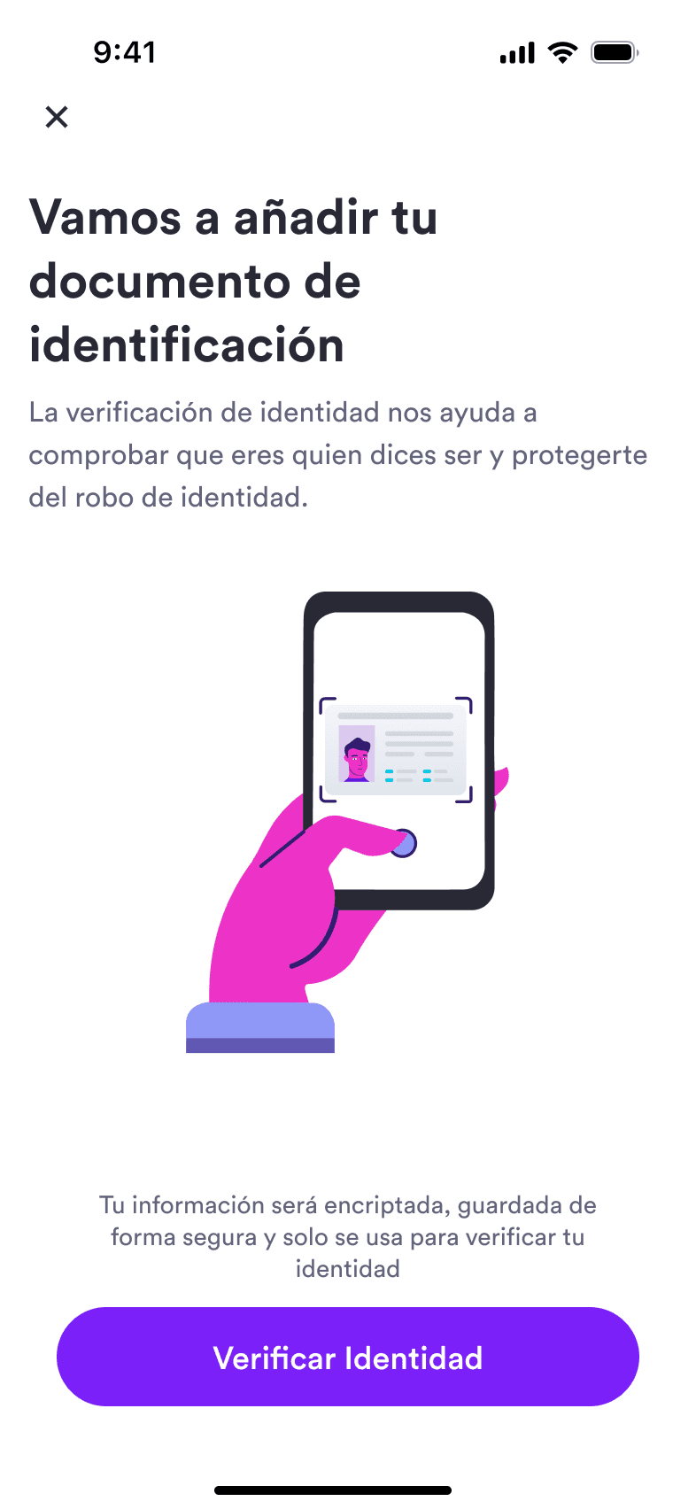
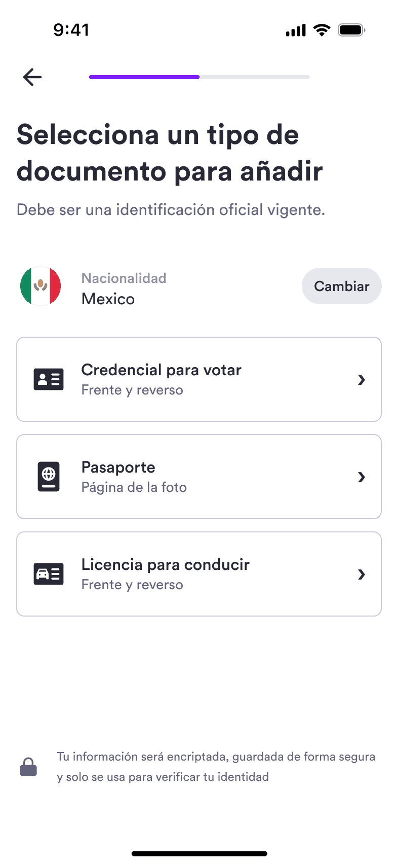
We prioritized making the onboarding as simple as possible. Banking signups are complex due to all the 'Know Your Customer' (KYC) requirements they have, so it was very important for us to reduce the number of steps it took to get an account and to give as much helpful information to the user as possible.
Card management
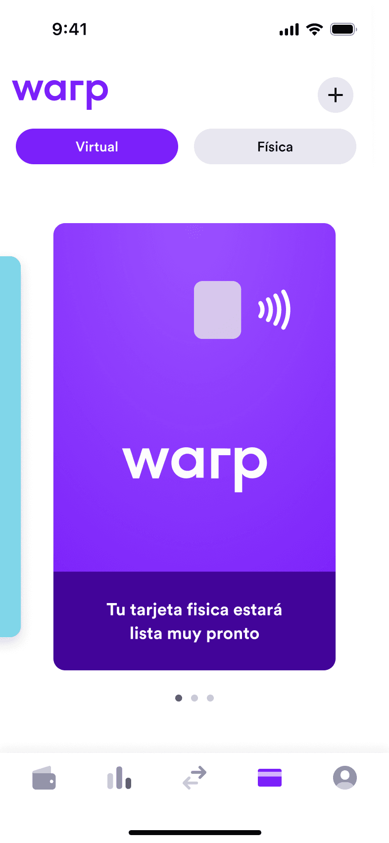
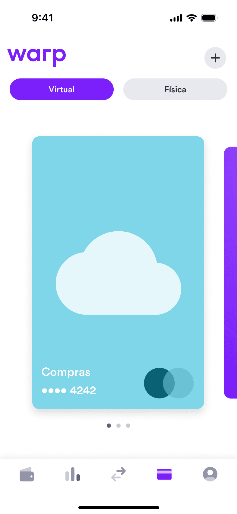
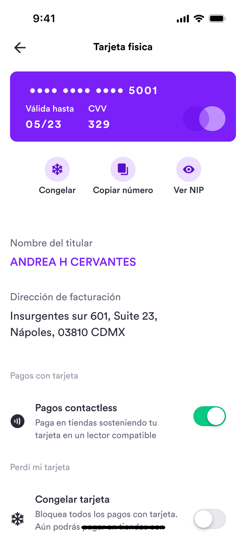
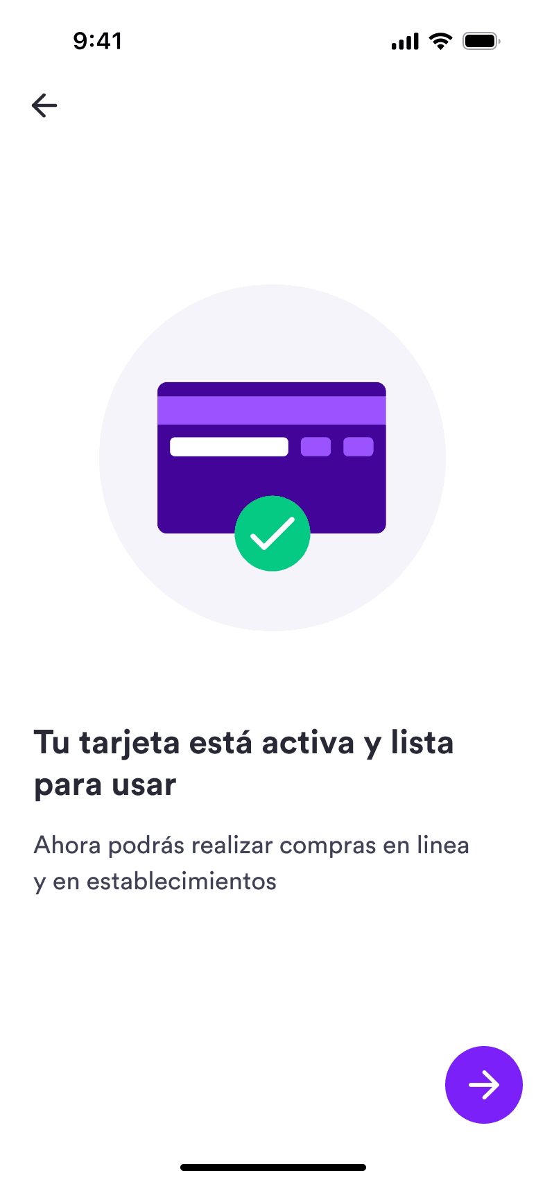
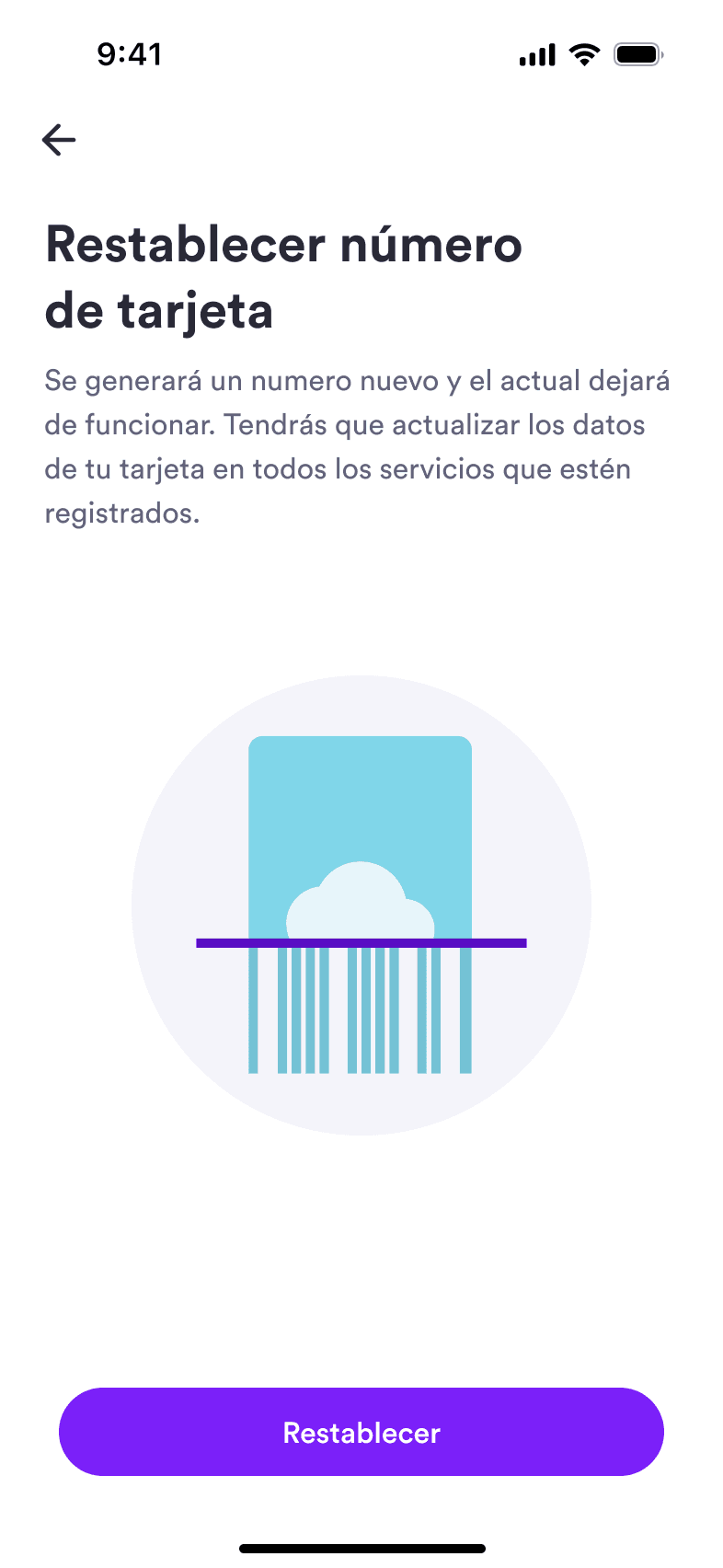
Security is vital for a consumer banking product. Our card management feature allowed customers to get full control of their virtual and physical cards. They can lock/unlock their cards if they get lost or stolen, replace them and change other security settings like the PIN number or the types of payments allowed with them.
Payments
P2P payments
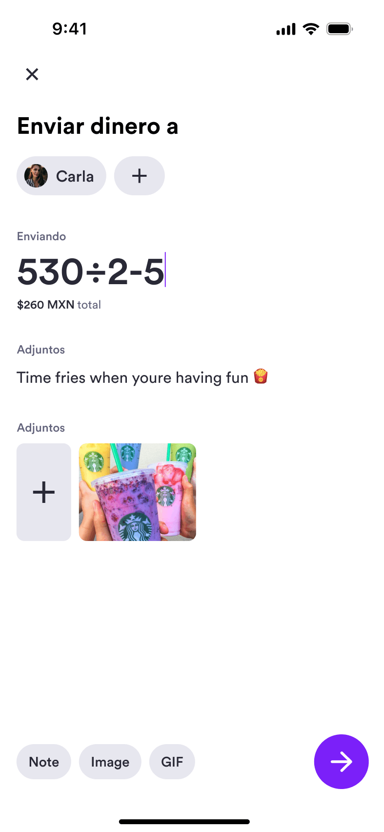
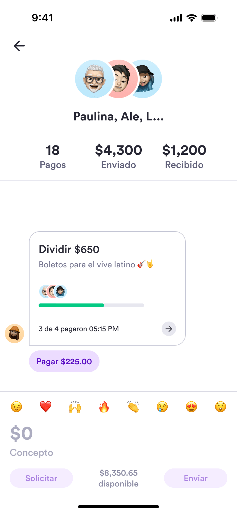
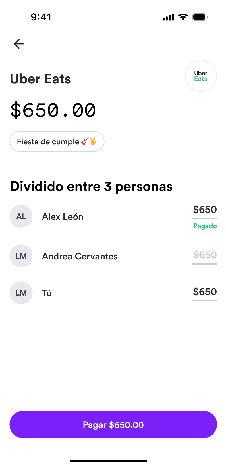
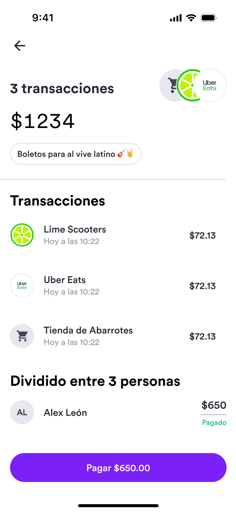
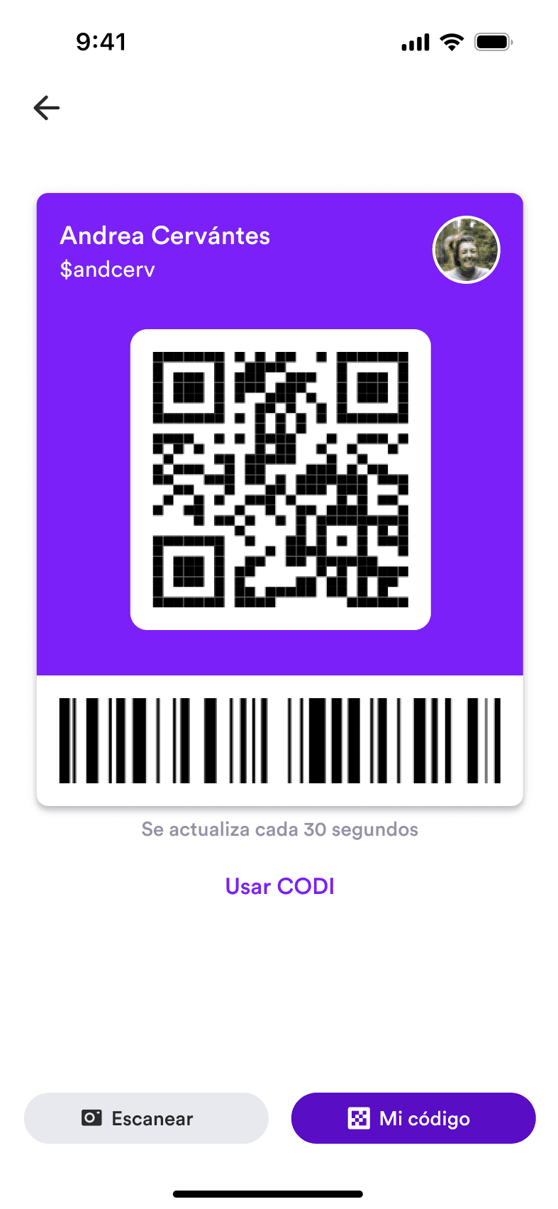
One of the key features of the Warp app was our payment system, and it's the part we spent the most time designing. Most apps treat sending money as a one-off act, but we noticed that in real life you send money to the same people over and over — and they send it back. We also realized nobody handled splitting a bill well; you usually can't unless everyone pays on separate terminals. So we designed payments around those real behaviors: sending to and requesting from the people you pay most, and splitting bills with friends directly in the app. Customers can also send and receive money from anyone in Mexico, pay via QR codes, and send bank transfers via SPEI — all inside the app.
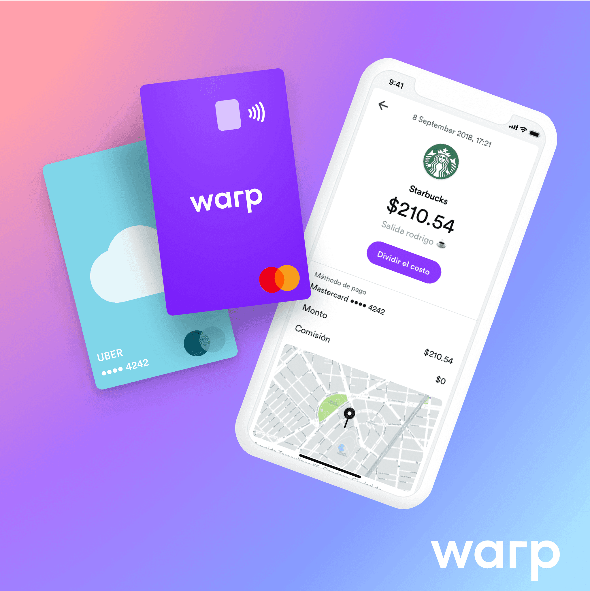
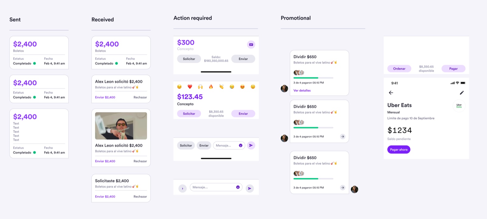
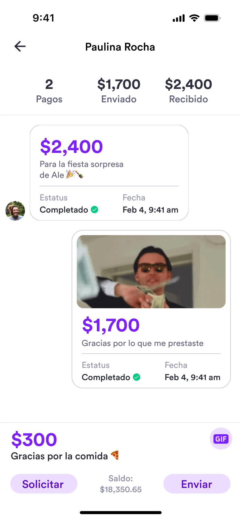
Payments show up as messages, so it feels more familiar to the user, kinda like sending a text. So I designed the whole family of states — sent, received, action-required, and promotional — as reusable components, including split-bill progress and bill reminders.
And, this is how they translated into the interfaces once implemented:
Service payments
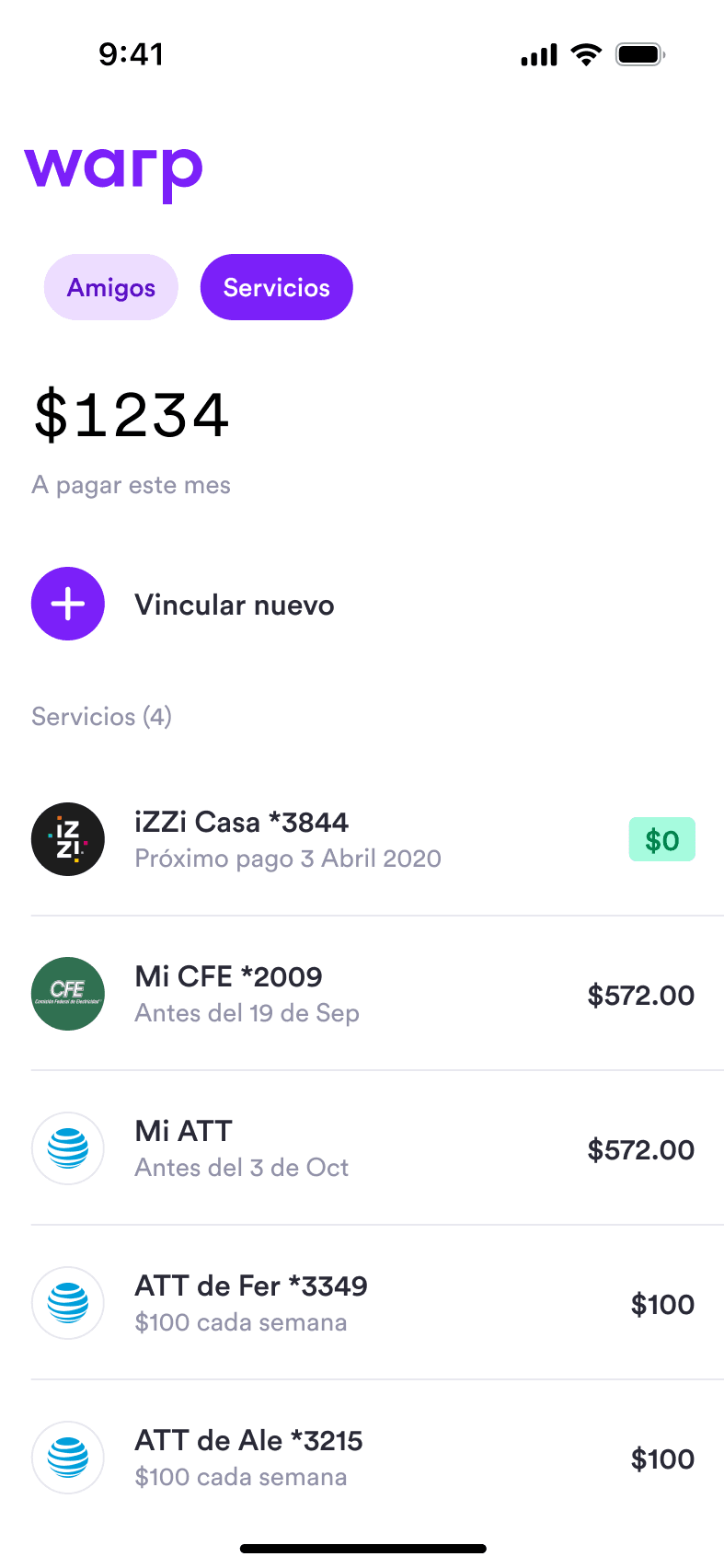
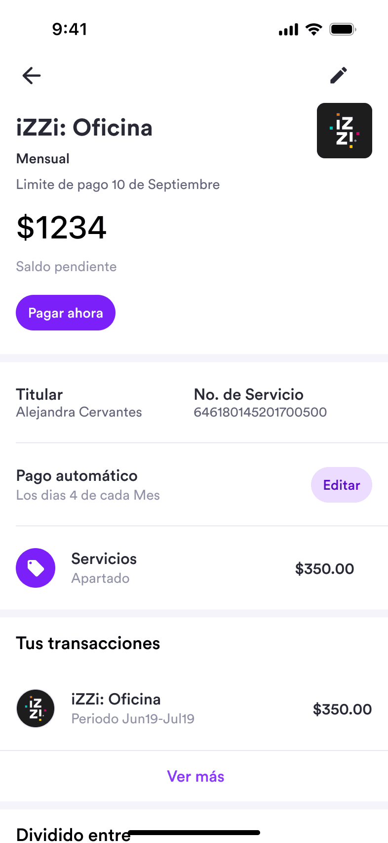
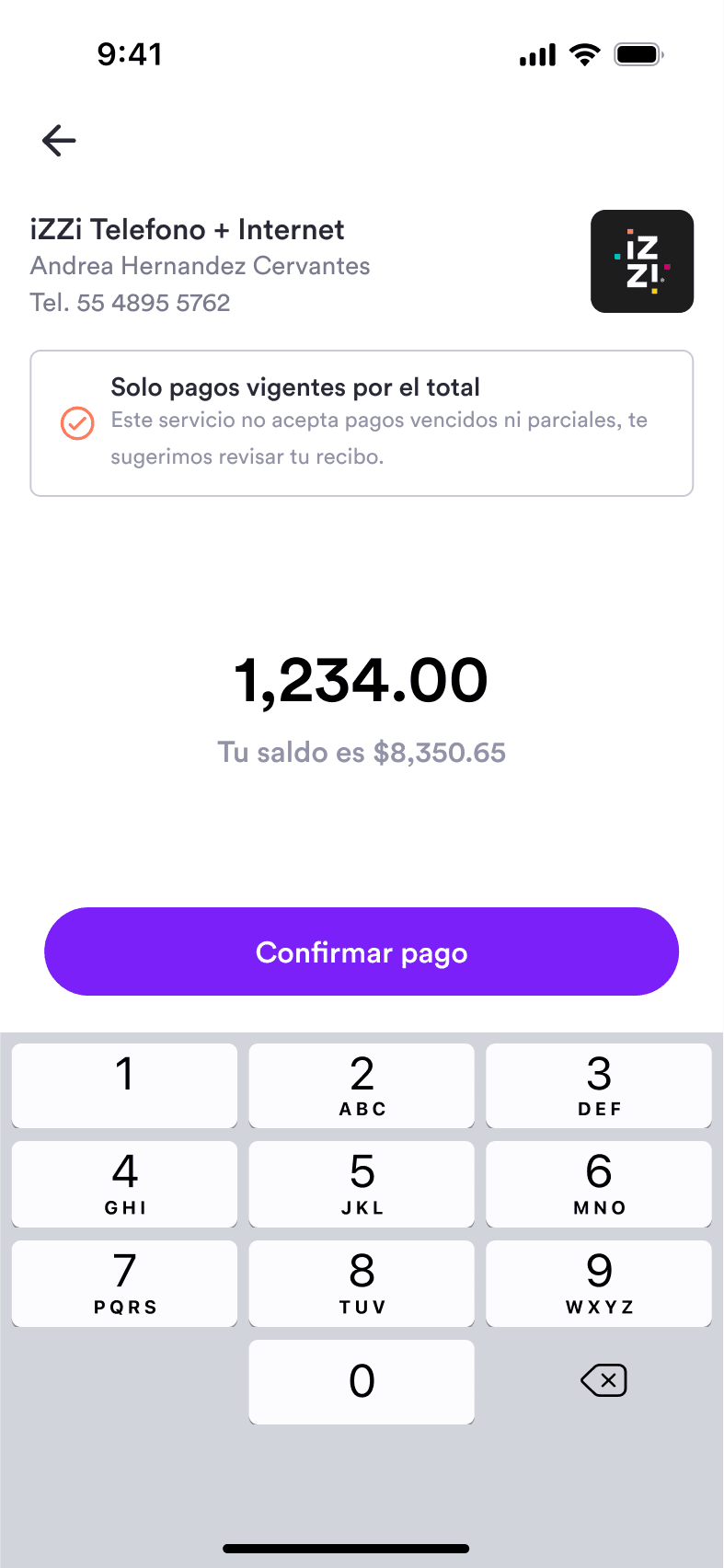
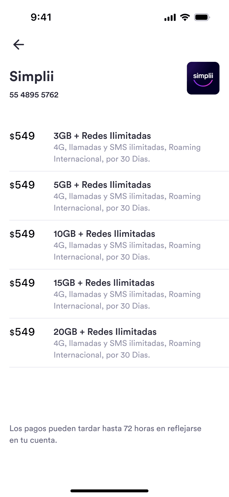
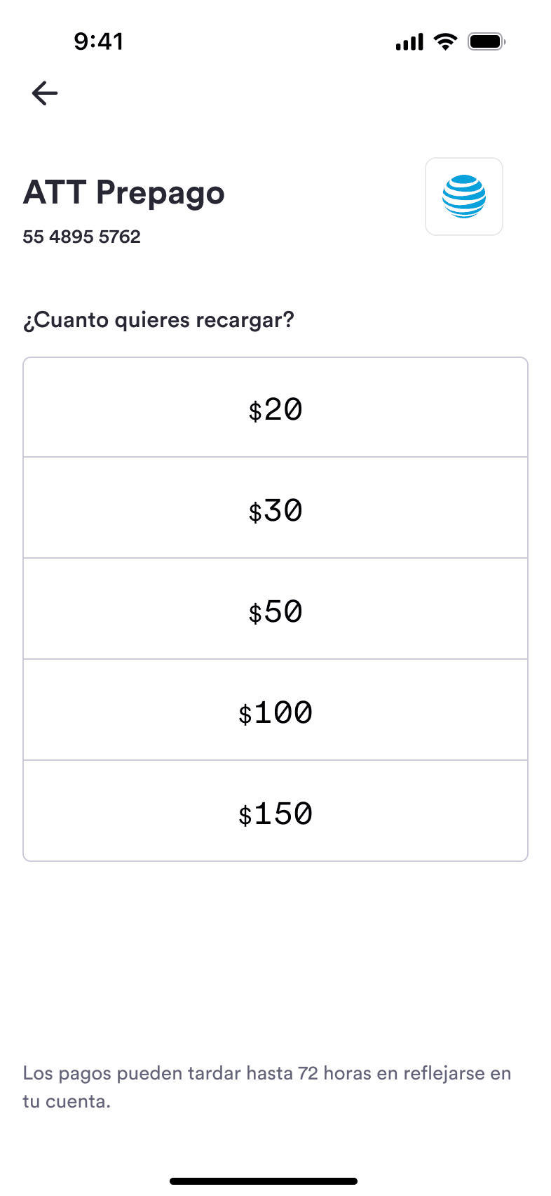
Warp also handled everyday bill payments such as utilities, phone credit, and recurring services.
Top ups and cash withdrawals
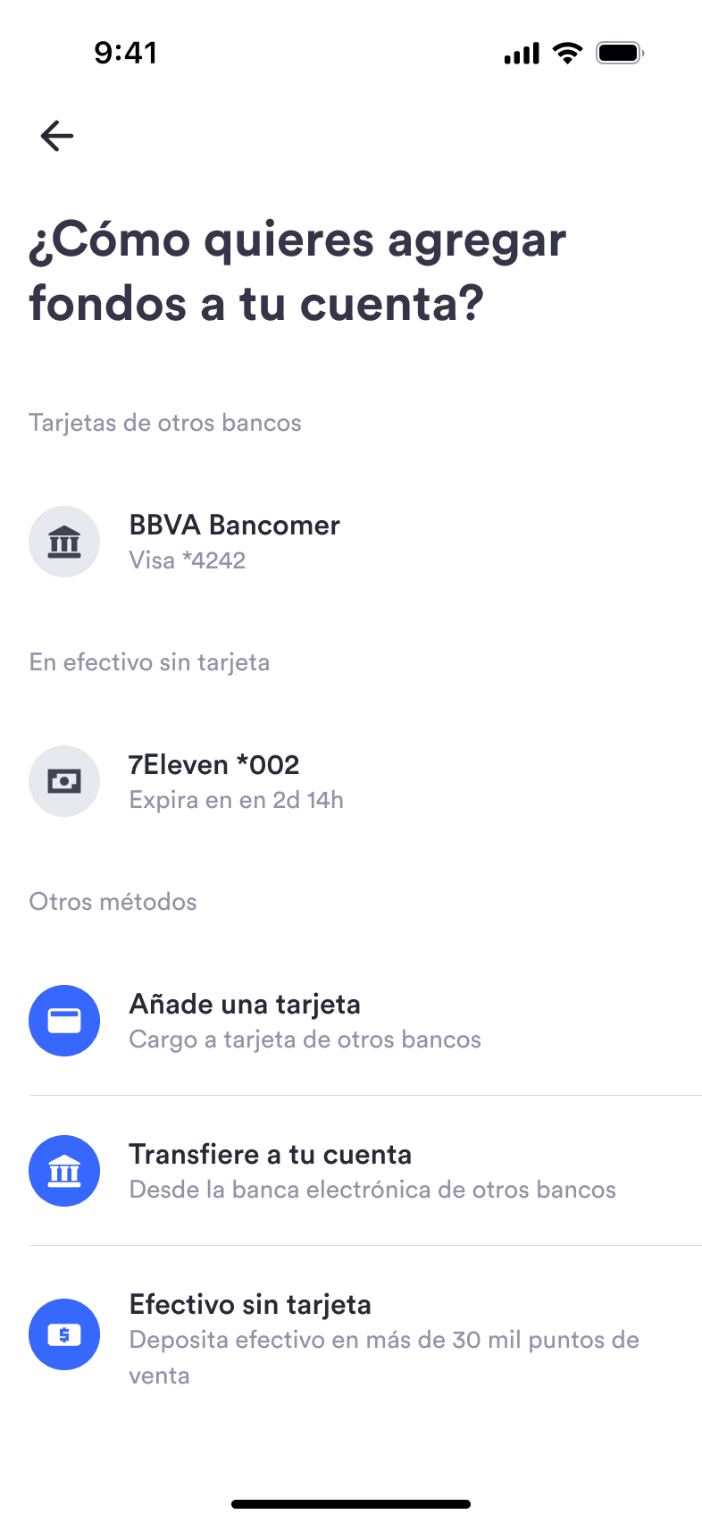
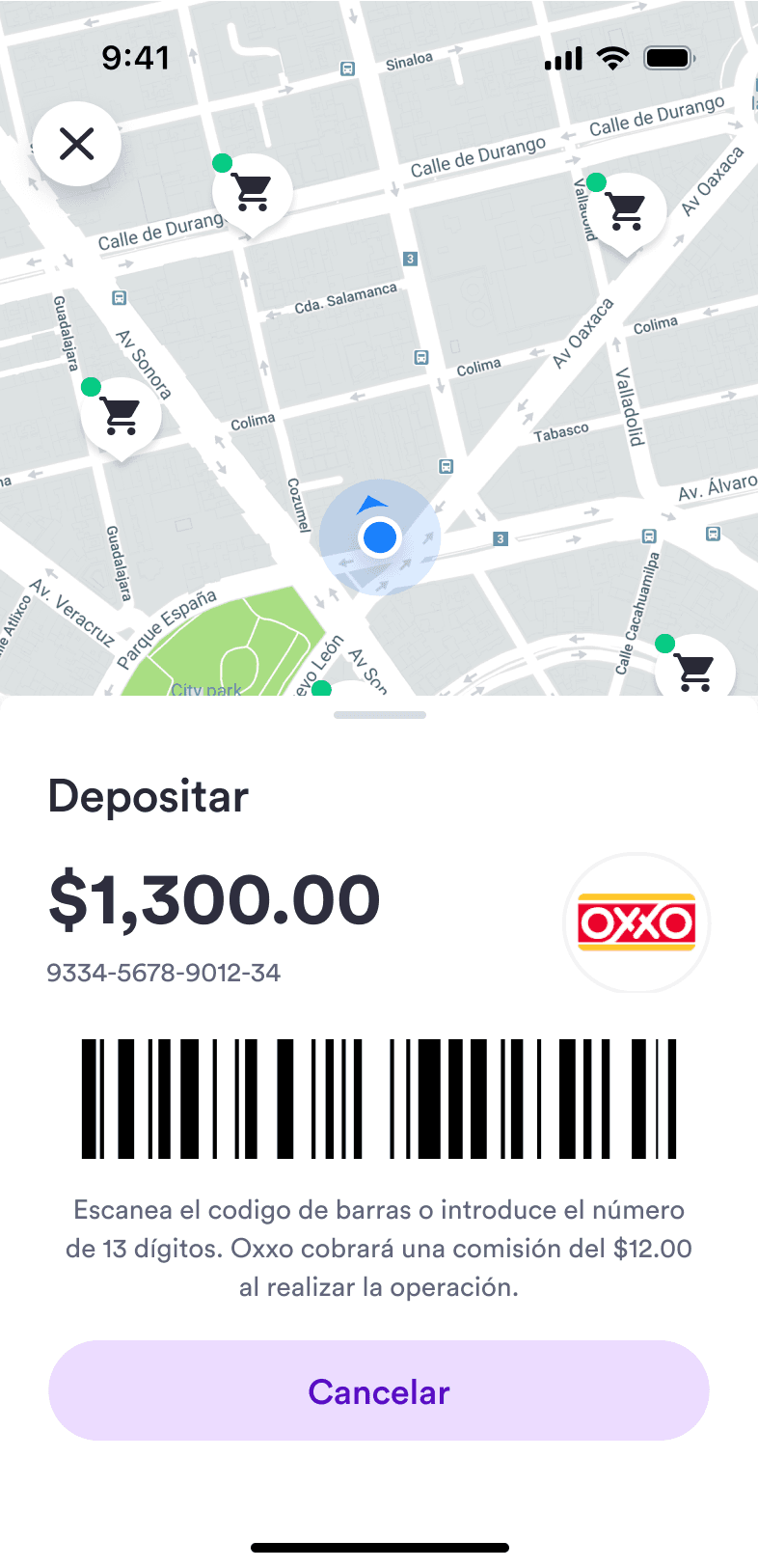
Our mission was to help the Mexican economy transition from a cash-based system to a cashless one, with infrastructure as efficient and instant as cash itself. To do this, we partnered with convenience stores all over the country so customers could deposit and withdraw cash from their Warp accounts at any of their locations.
Transactions
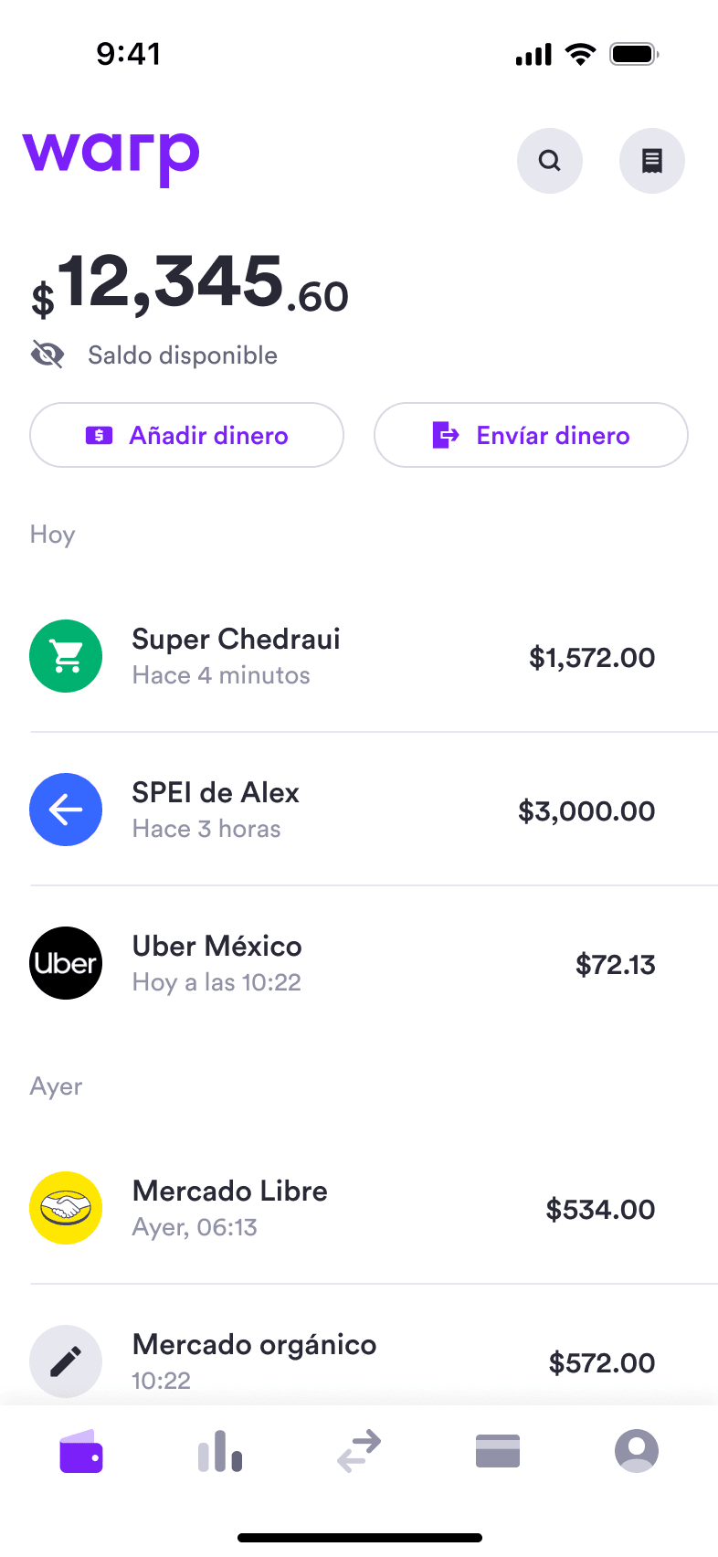
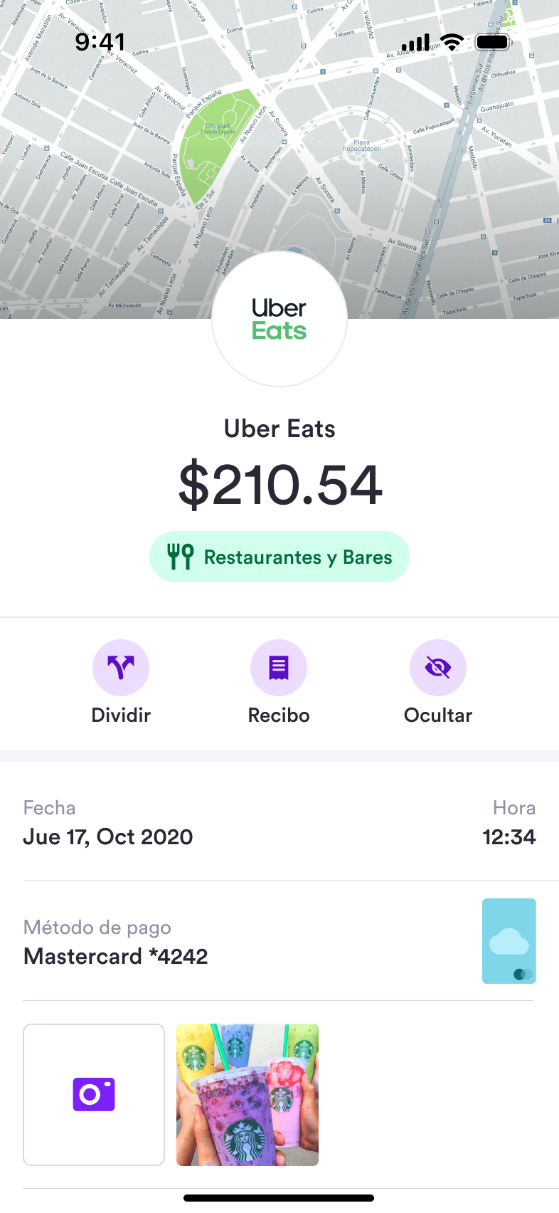
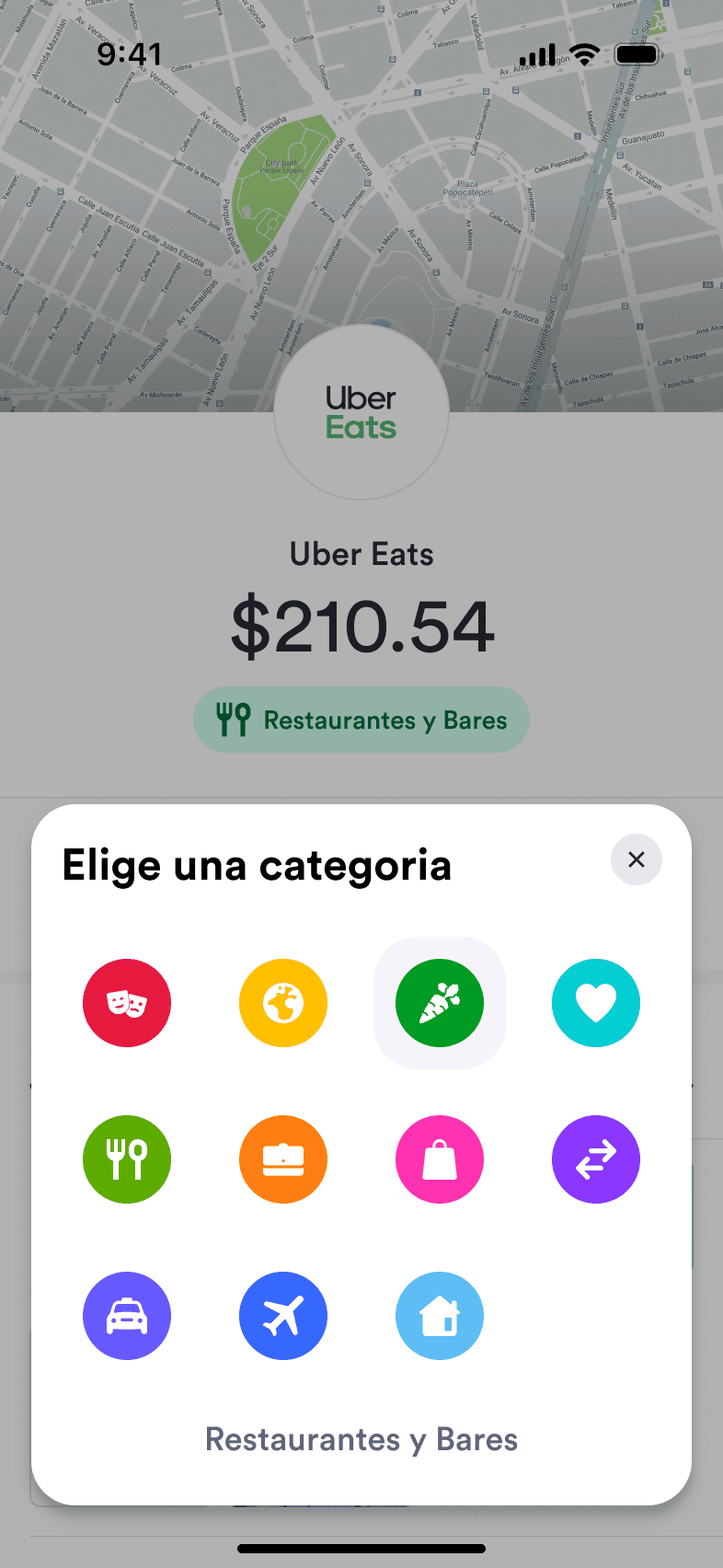
Every movement landed in a clean, searchable feed. Tapping a transaction opened its detail, and customers could recategorize spending to build an honest picture of where their money went.
Business dashboard
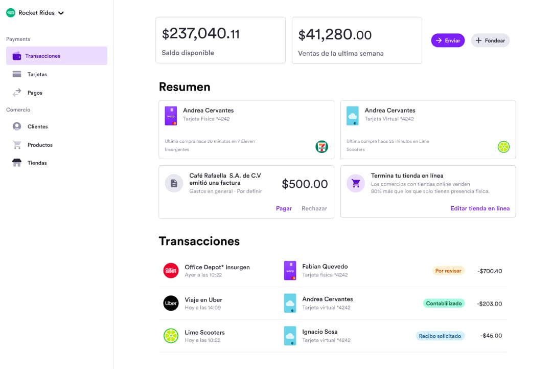
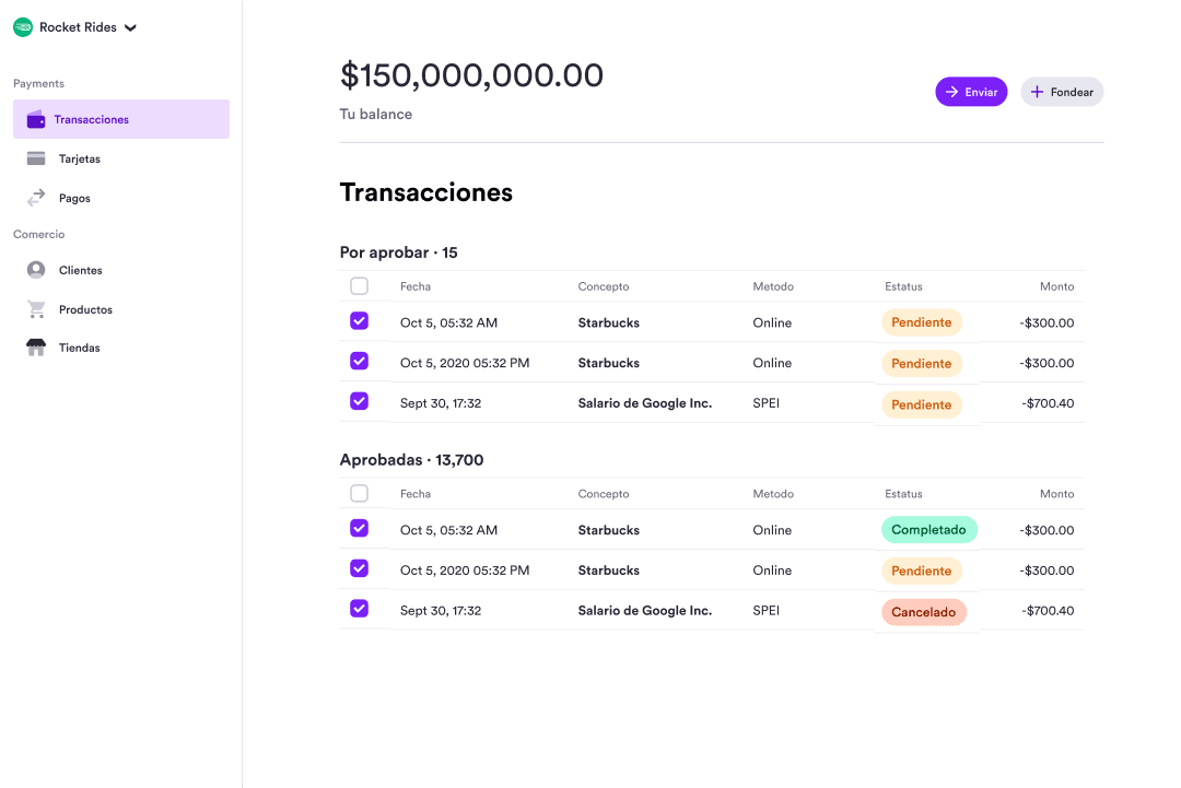
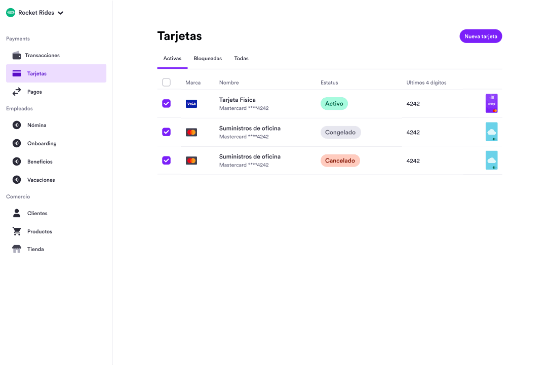
After our testing in the consumer industry, we wanted to test our product offering with merchants and small businesses, a sector that has largely been forgotten by the banking industry in Mexico and that's vital to economic growth. We started with a bank account for small businesses that gave them access to an online dashboard —apart from the app— from where they could manage their transactions, issue cards to employees, authorize charges and pay invoices.
Brand & launch
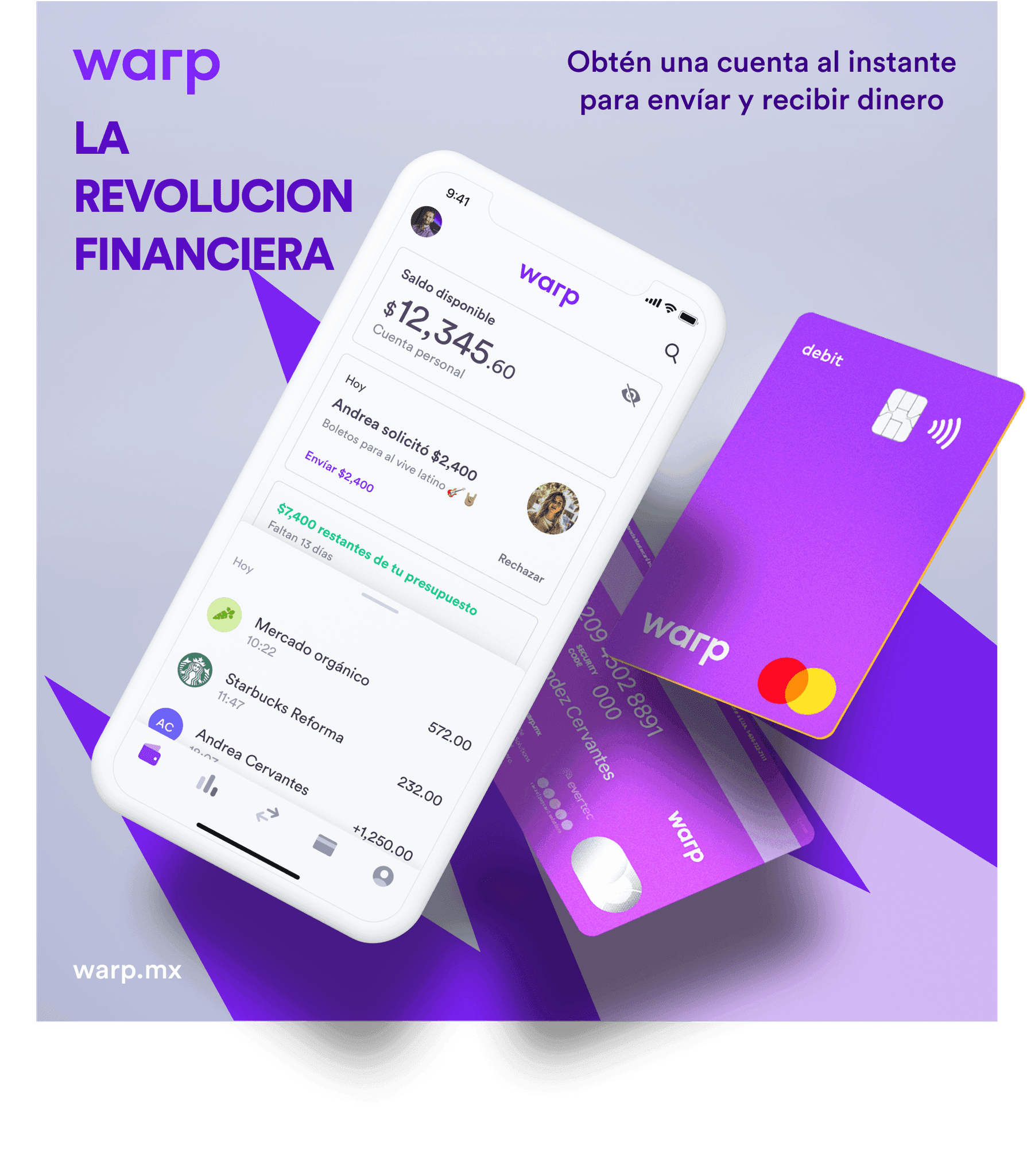
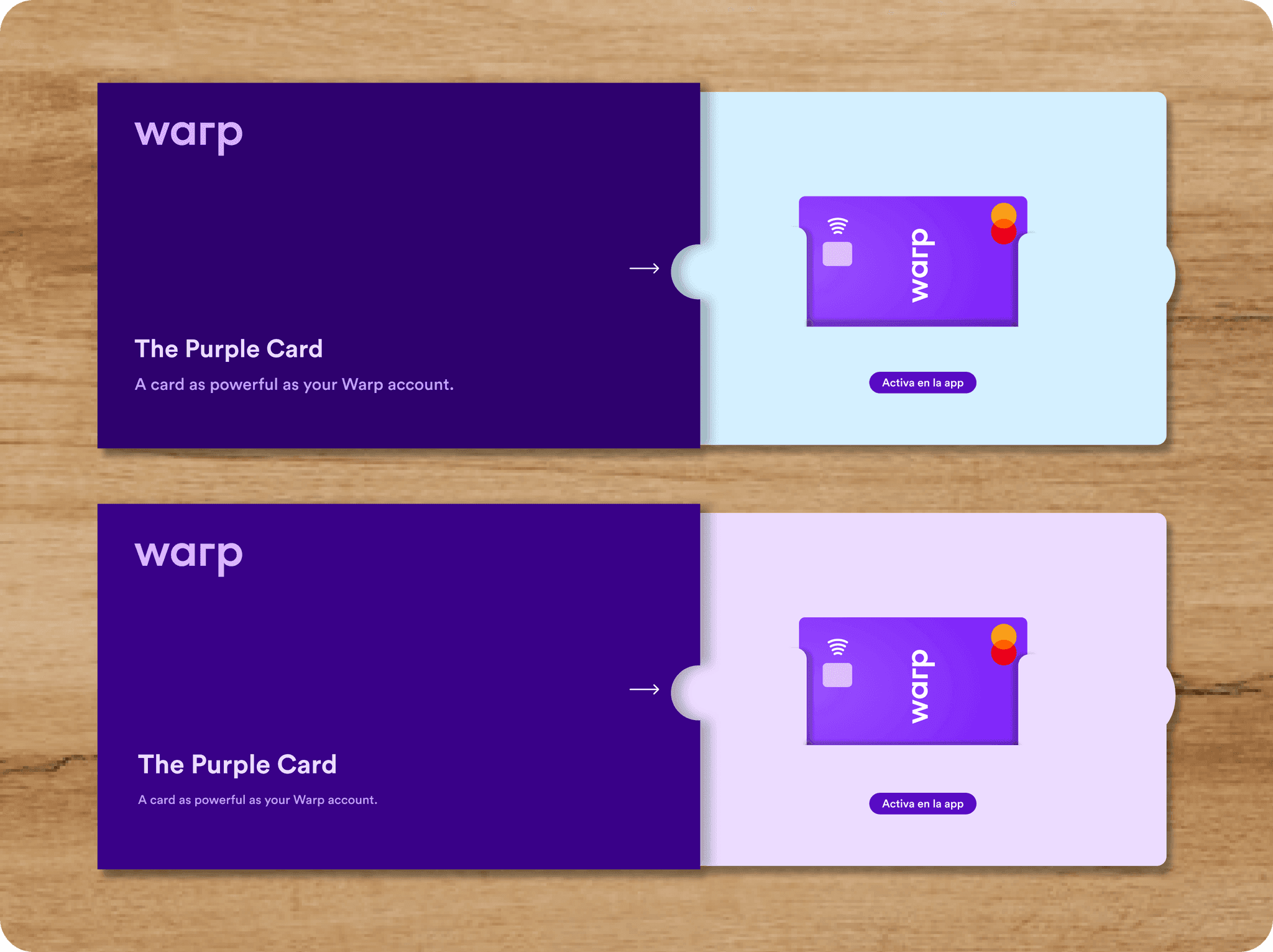
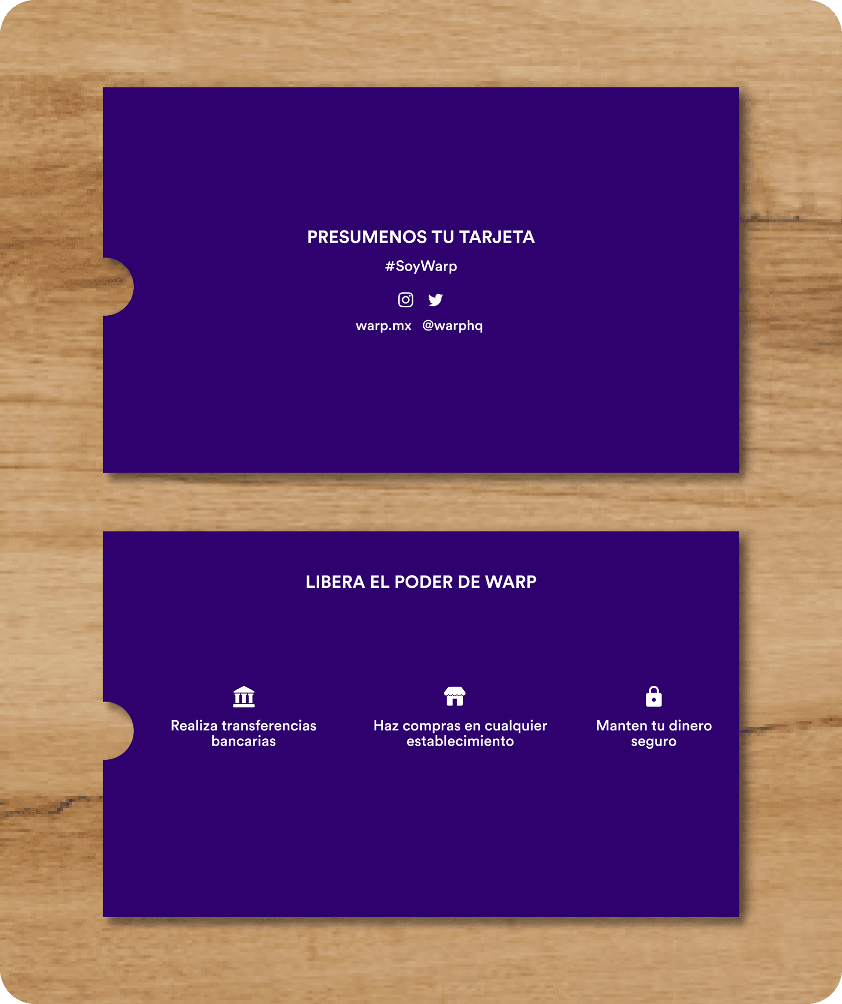
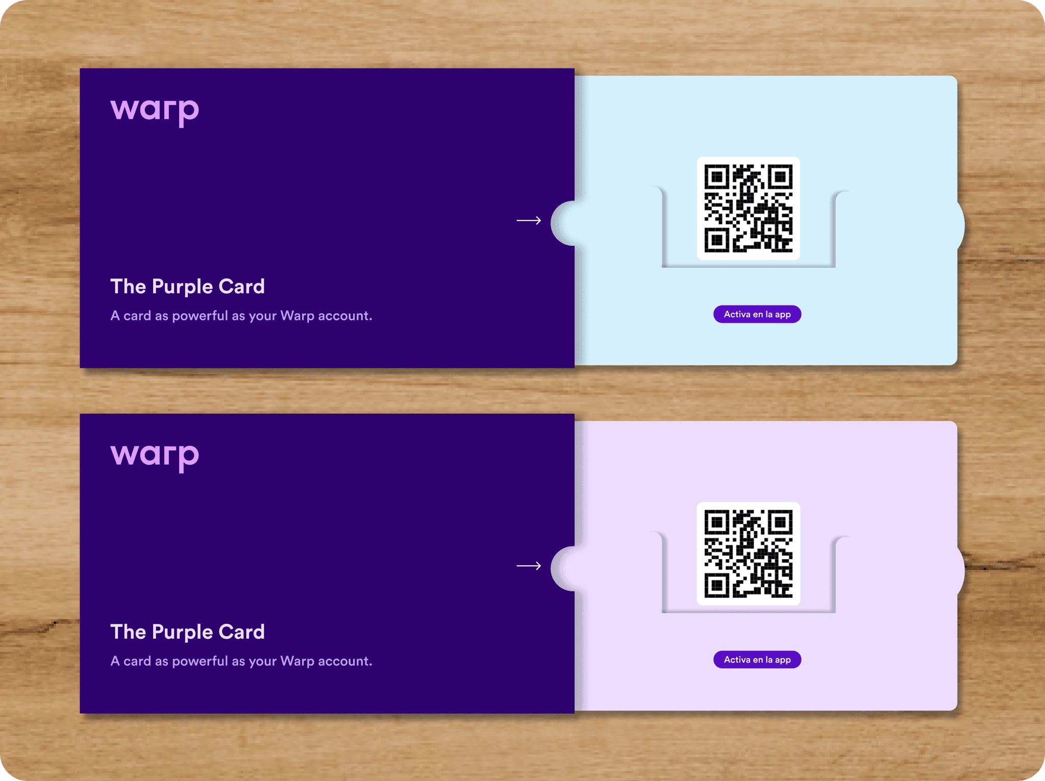
The design work went well beyond the app. I designed the card's packaging experience, leaning into purple to stand out on the shelf (I know — Nubank hadn't become the behemoth it is today).
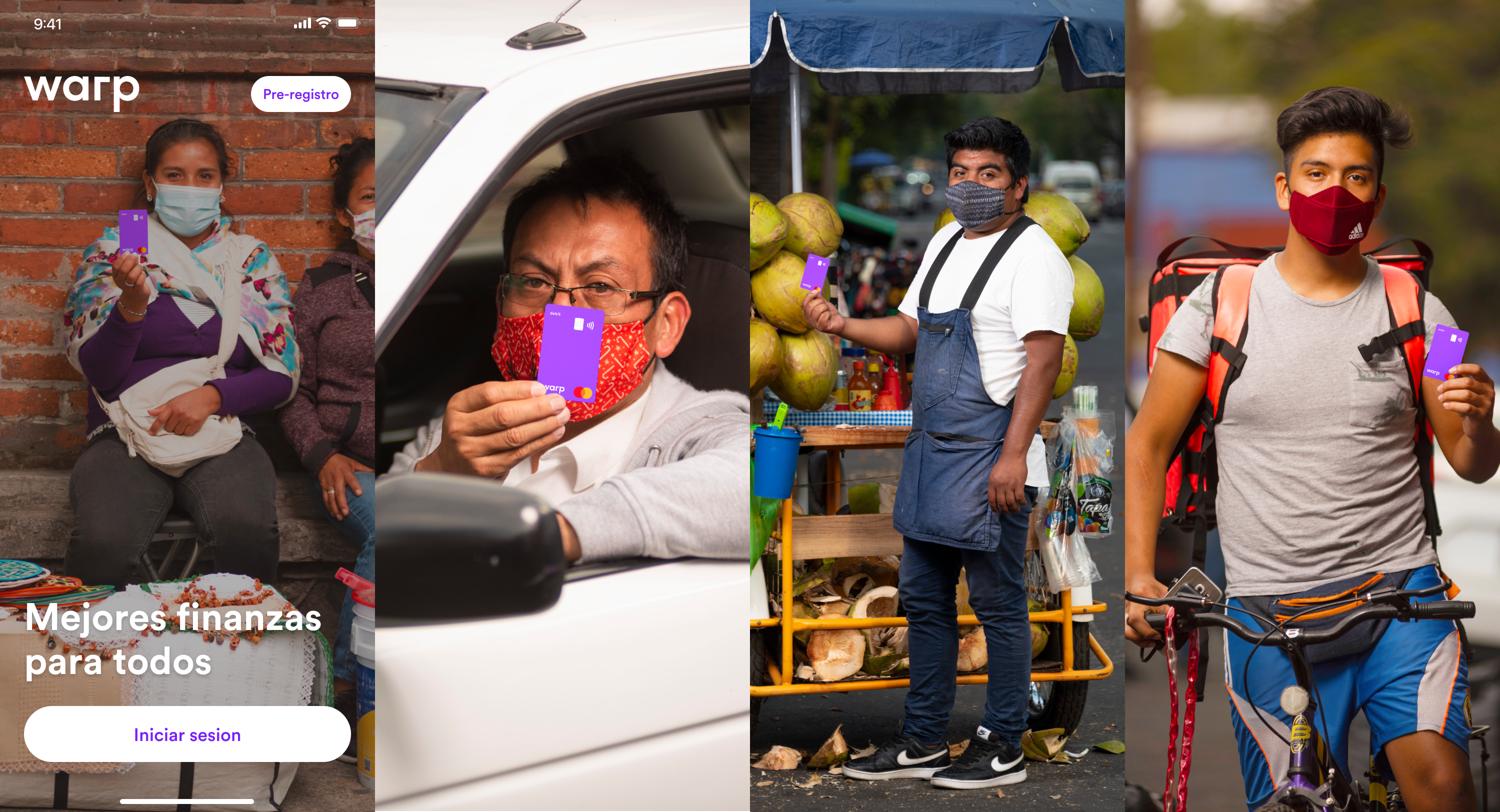
A field photo campaign put real customers — informal sellers, delivery and taxi drivers — on the login screen, so you saw who Warp was for the second you opened it.
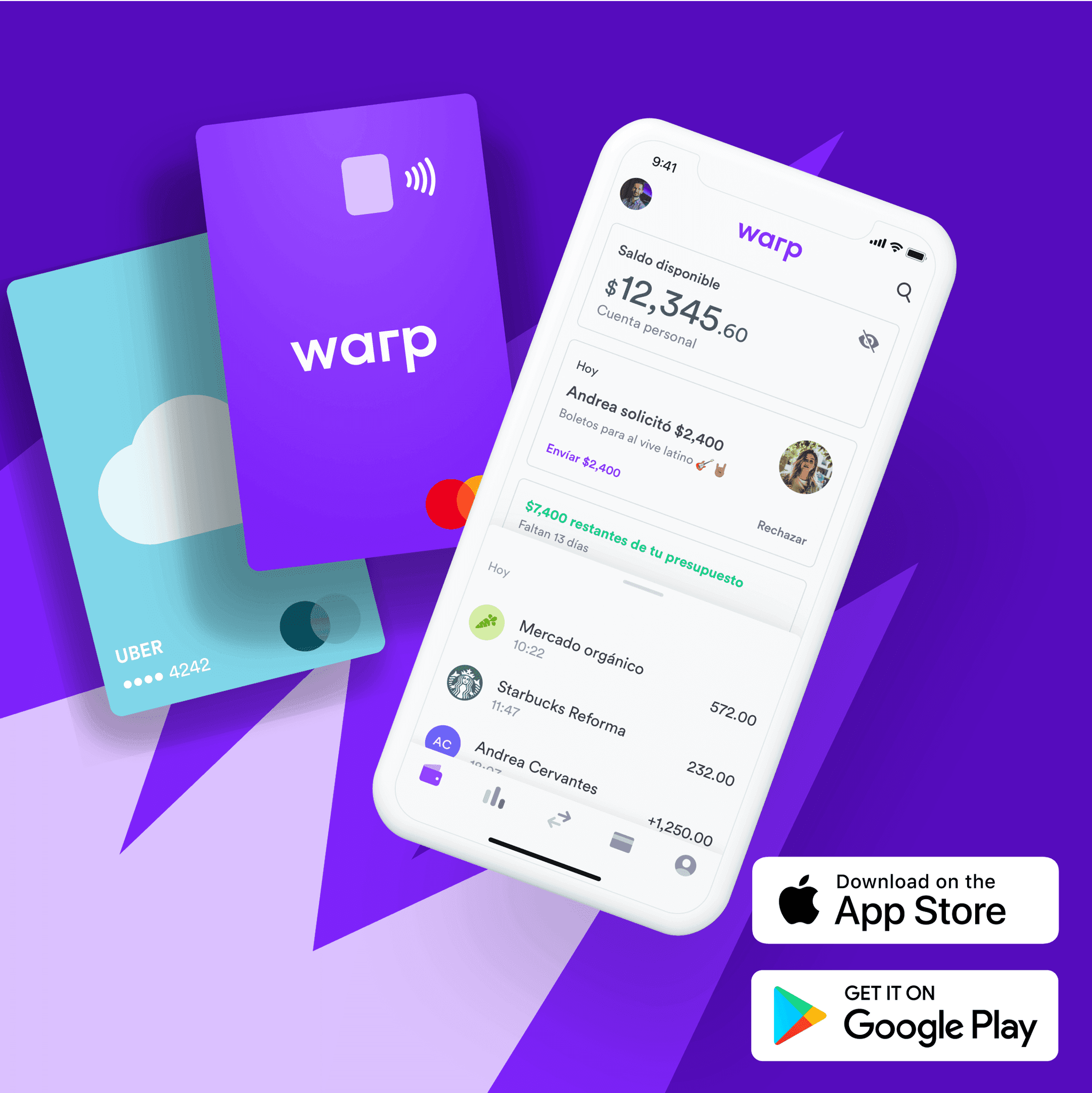
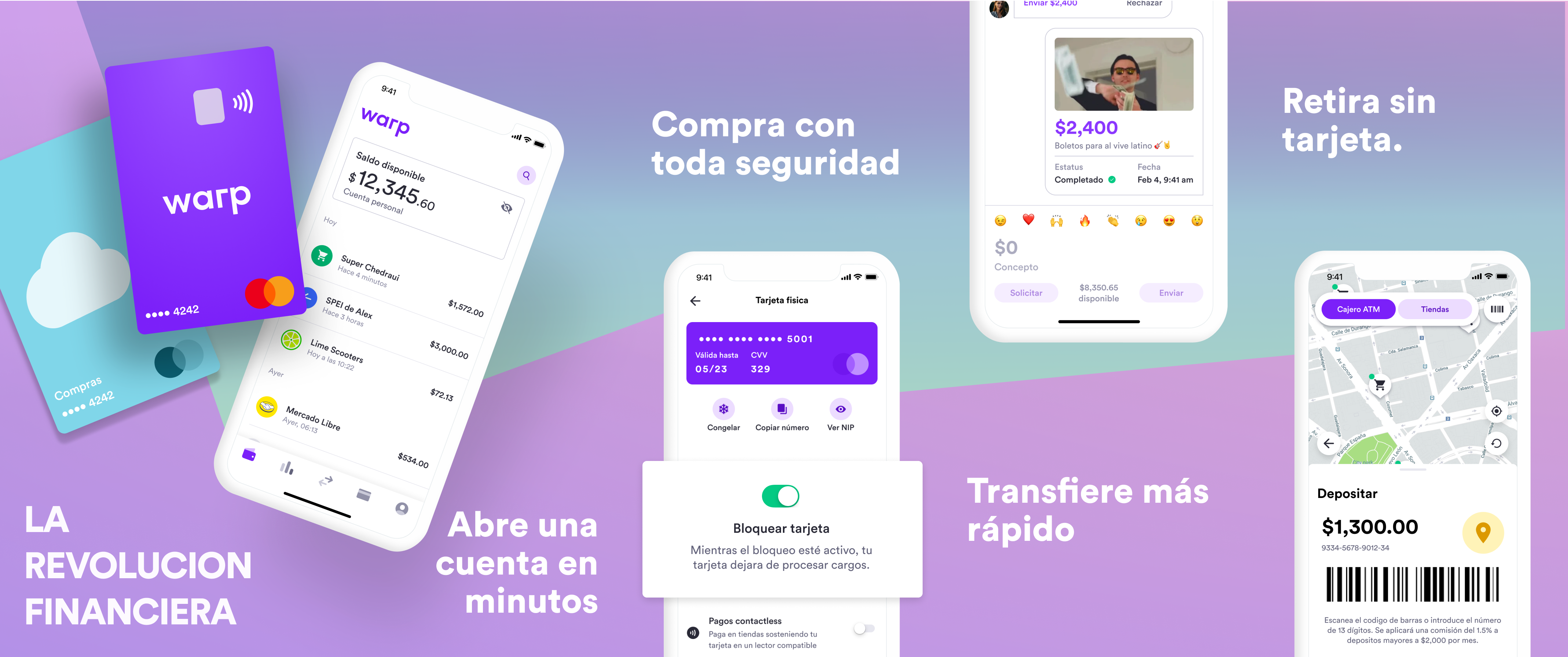
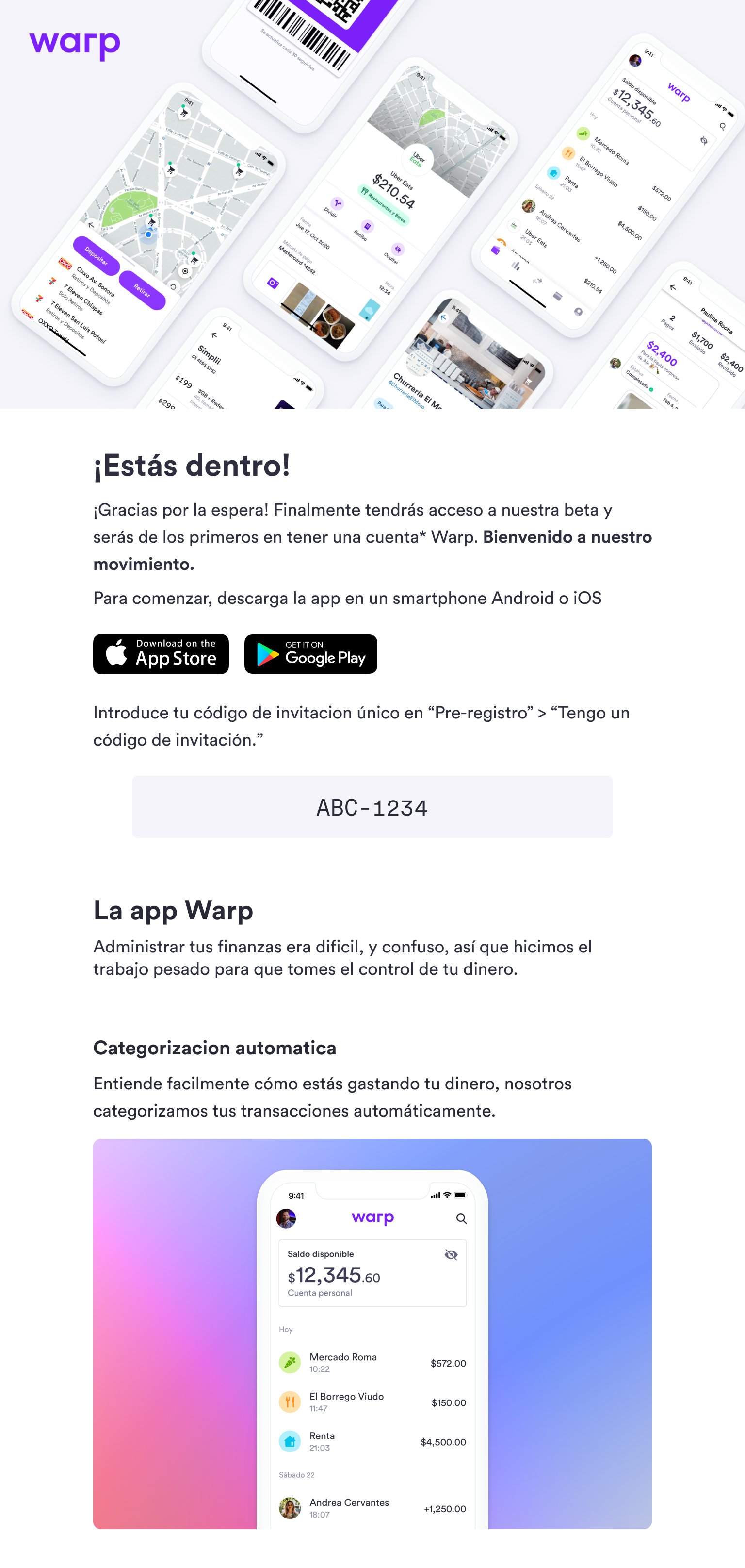
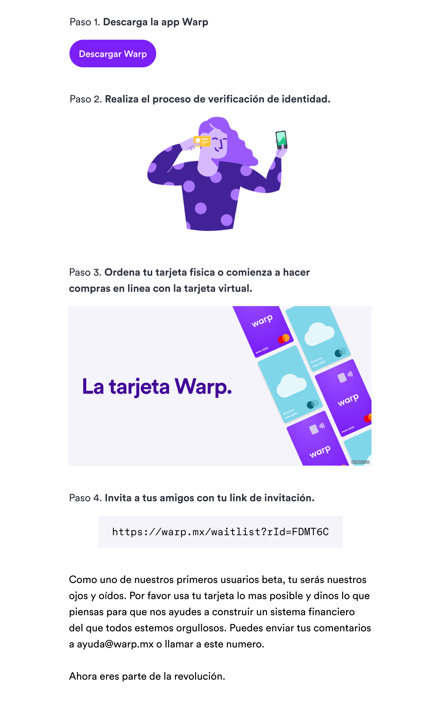
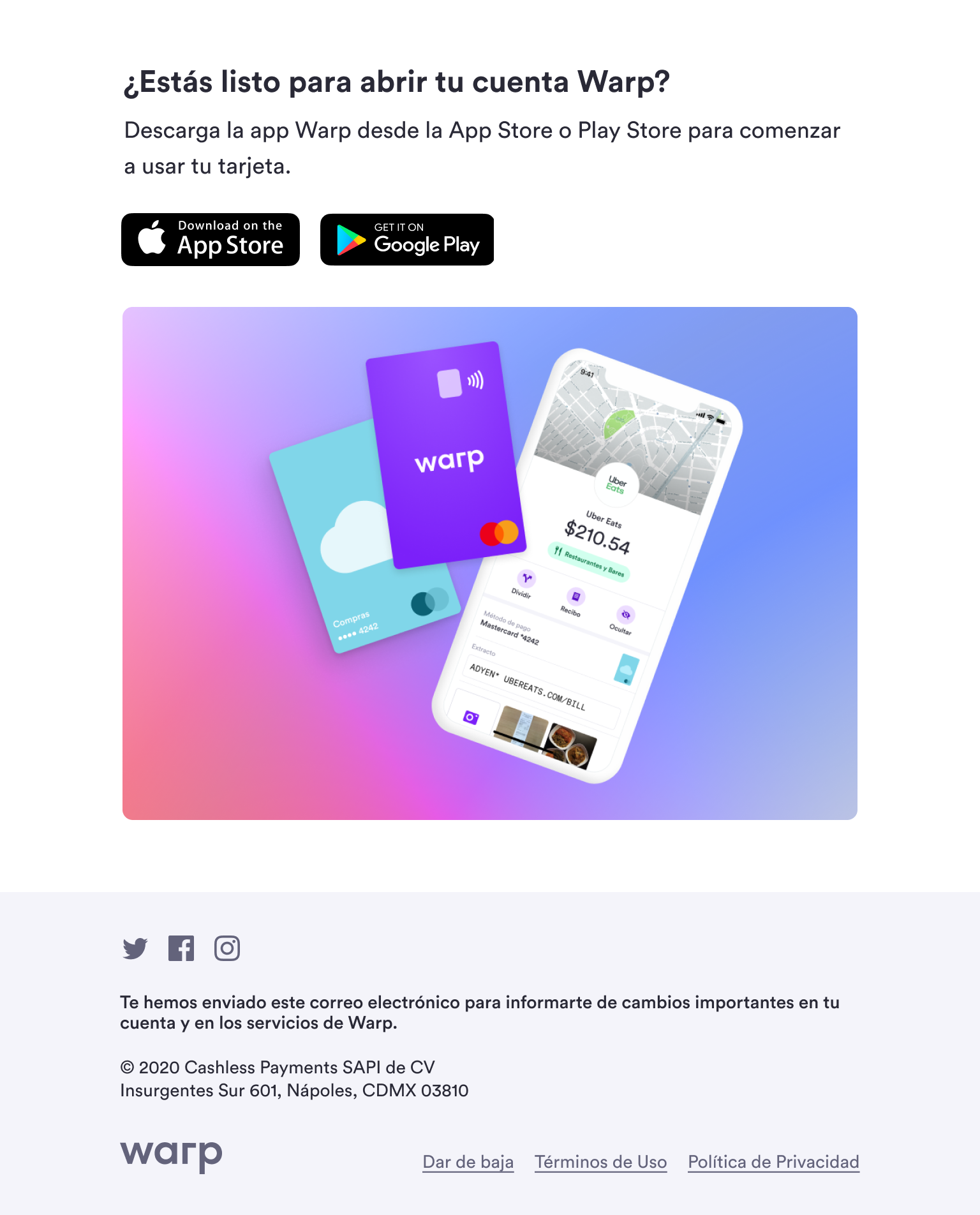
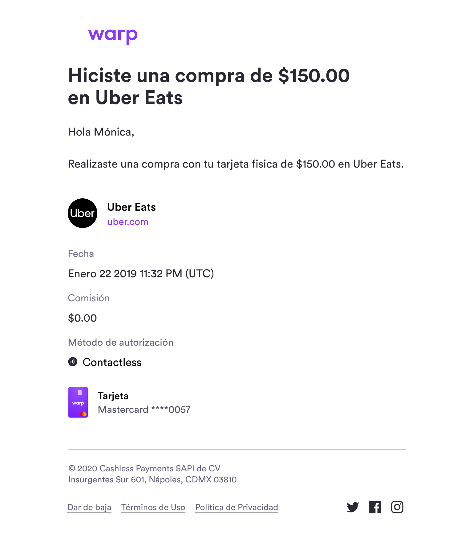
That same system extended into App Store assets, social, and a full set of lifecycle emails — early access, invite codes, and purchase confirmations.
Building a bank, and why it ended
Creating a financial product also meant building relationships with companies like Visa and Mastercard, and navigating Mexico's fintech law — a heavy regulatory regime with a long list of requirements to comply with. By the time we wound down we had built a waitlist of around 10,000 users eager for early access, but that compliance burden was ultimately what led us to end the project.