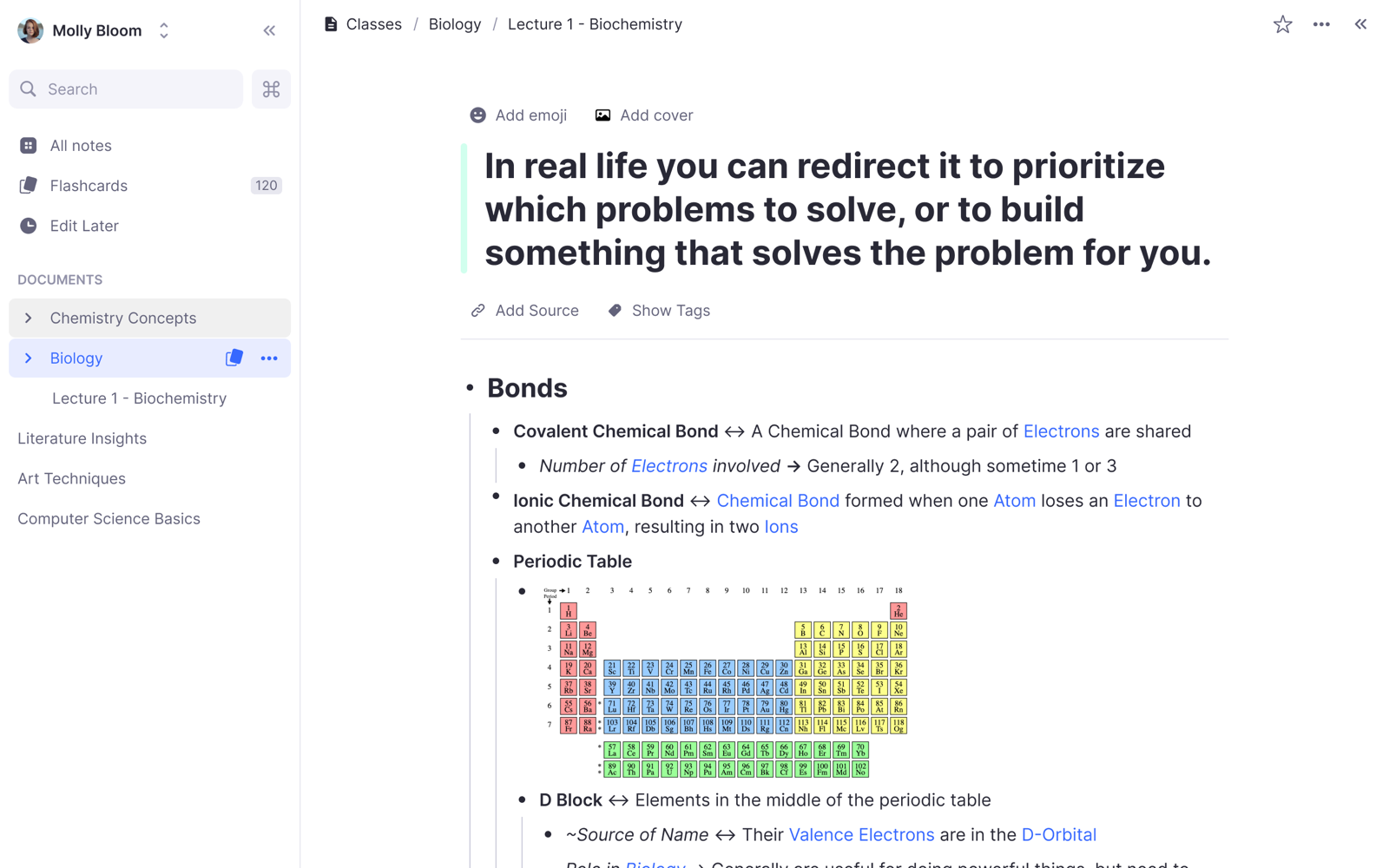
Remnote
January 2021
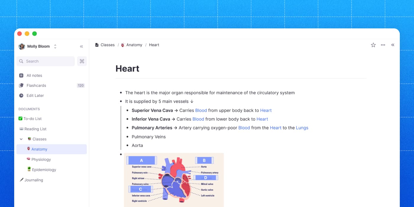
I joined RemNote with the goal of redesigning the app and website to increase usability and conversion while decreasing churn. We did this with a full redesign and a comprehensive design system.
What is RemNote?
RemNote is a note-taking app that puts flashcards directly into your notes, so studying and memorization happen where you already write — a product used by millions of students. I joined as the company's first employee, right after its fundraising round, and stayed for about two and a half years as the lead designer working closely with the founders on product strategy and specs.
I came in to fix a specific problem: the product was powerful but hard to use. It carried a lot of complexity, and the interface was, frankly, ugly. My first mandate was a total uplift — a ground-up redesign of the entire product.
A design system from the primitives up
Since my experience at Warp taught me that we need some basic layers we could build from, we created a styleguide (typography, color, spacing), then a reusable component library (buttons, inputs, and the rest of the common set), and then moved up to actual interfaces.
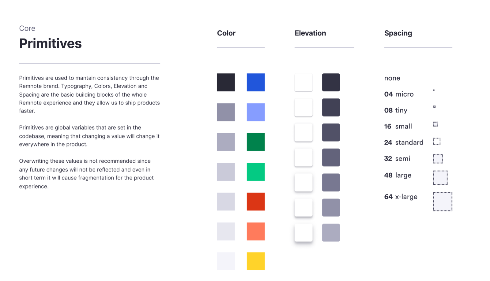
This actually turned out to be a great call because for a long stretch I was the single designer providing specs for five to six engineers. Without a system, consistency would have eroded the moment we started shipping in parallel. And in fact it did, we had to go through a few wrong PRs before we were able to get everything consistently into the app. I guess this is one of the flaws of not always working hand-in-hand with engineers.
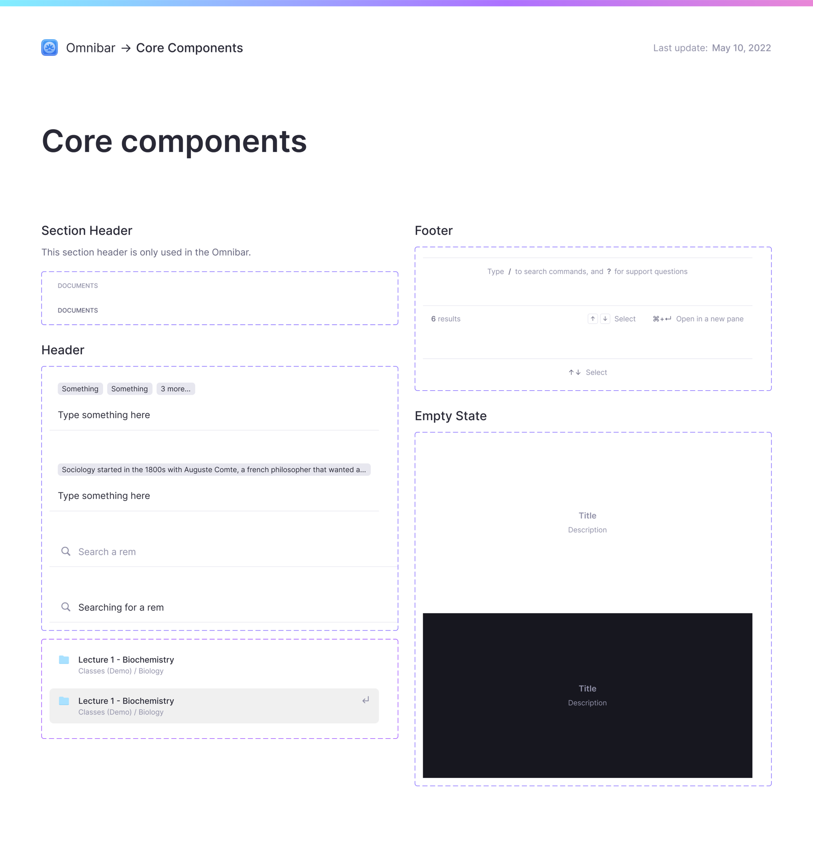
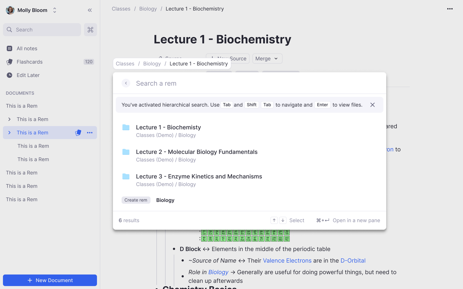
Once that was fixed, those primitives fed a component library that got updated over time. Here are a few of its core components — the omnibar's section headers, headers, footers, and empty states — each documented its states and usage rules so the whole team could build from the same parts.
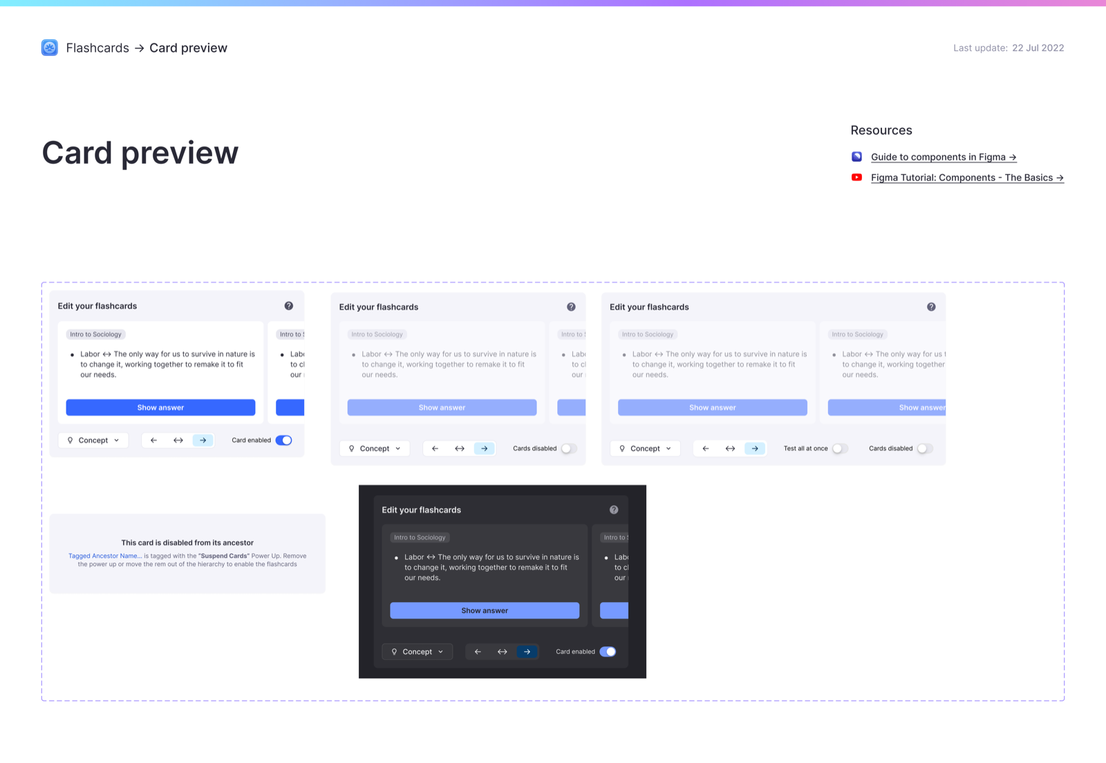
Speccing every state was really helpful to visualize any potential edge cases. Here's the flashcard editing card documented across its enabled, disabled, and dark-mode variants.
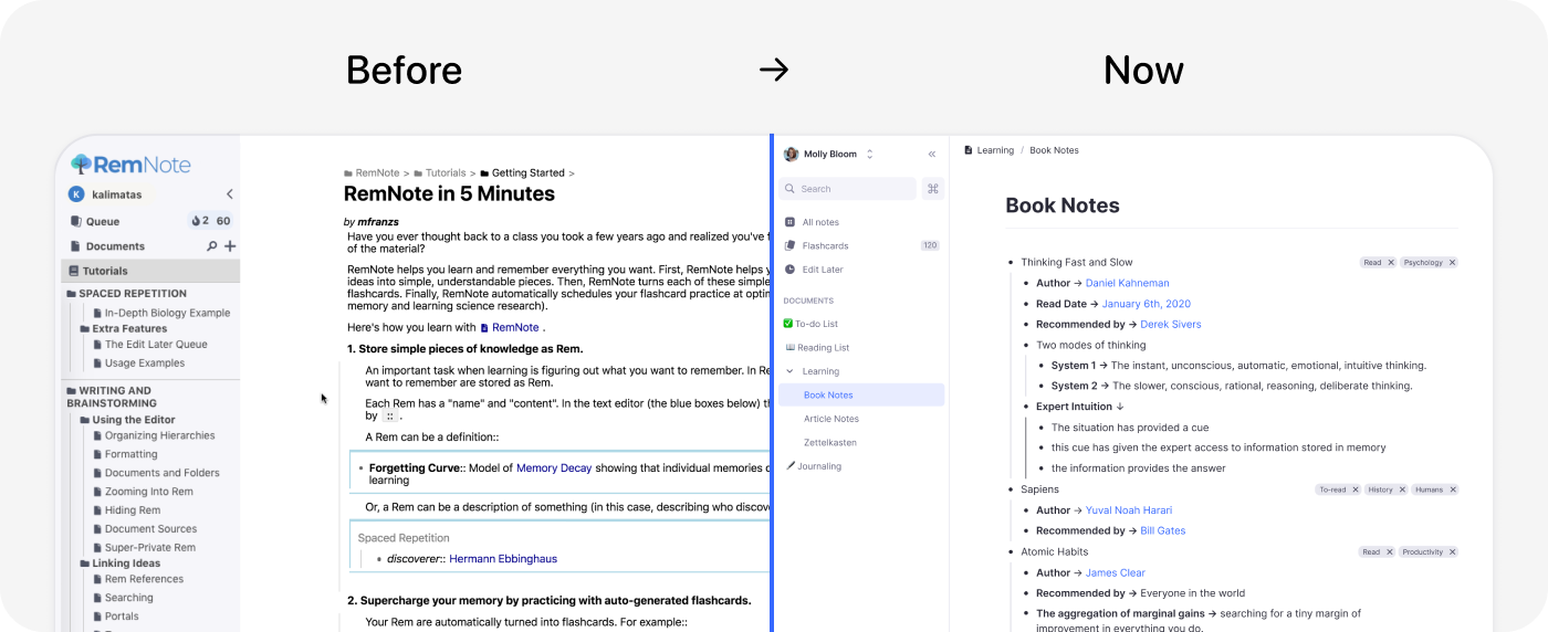
Over time, this caused a total shift in how the product felt. We were able to move from a cluttered interface to one that could actually create user growth and increase retention.
In the first release after I joing the company we were amazed by how much love we received from customers for cleaning up the UI.
“The old UI was great but this new one is just so smooth… I kinda don’t want to go to the old UI after testing this one.”
“This update changed everything for me. Now RemNote is both pleasing to my eyes and smooth for my brain to work, boosting productivity to a whole new level. I now have more confidence to introduce RemNote to EVERYONE that I know.”
Bridging power users and beginners
The central design tension at RemNote was audience. The team was split between serving students — often not especially technical — and serving power users, note takers who loved the app for its complex knowledge-work capabilities. RemNote is an outliner: you can zoom into any bullet and nest hierarchies infinitely, going deeper and deeper into a point. That power is great in the hands of experts but the way it was packaged made it difficult to understand for newcomers.
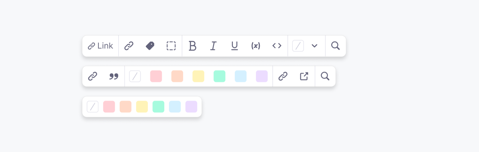
Most of my hardest decisions were about closing that distance without dumbing the product down. For example, we originally had a an unfamiliar formatting toolbar that was hidden and lived at the bottom of the page, till I introduced a new design that put text styling, links, and highlight colors one click away.
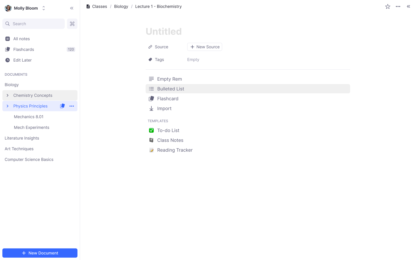
Another example is this block picker for inserting templates or turning a line into a flashcard — actions that previously had no visible entry point at all. Together they made the app's power discoverable for students while staying out of the way of people who already knew the shortcuts.
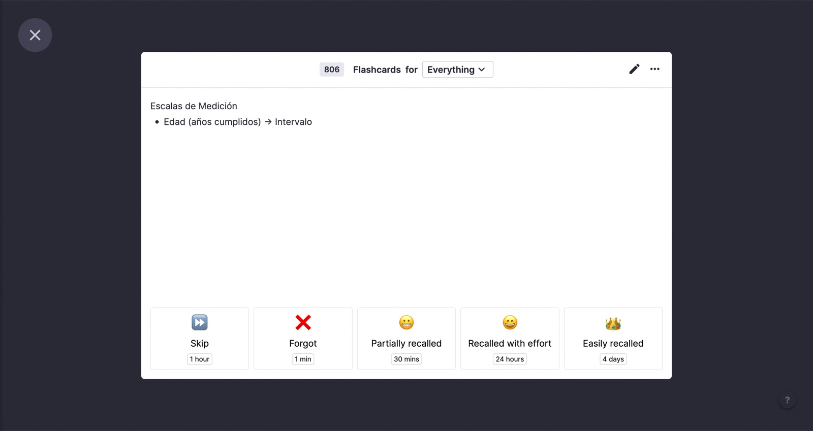
All of that capture exists for one thing: review. RemNote turns the notes you write into spaced-repetition flashcards, graded from Forgot to Easily recalled, so the next review lands at the right time.
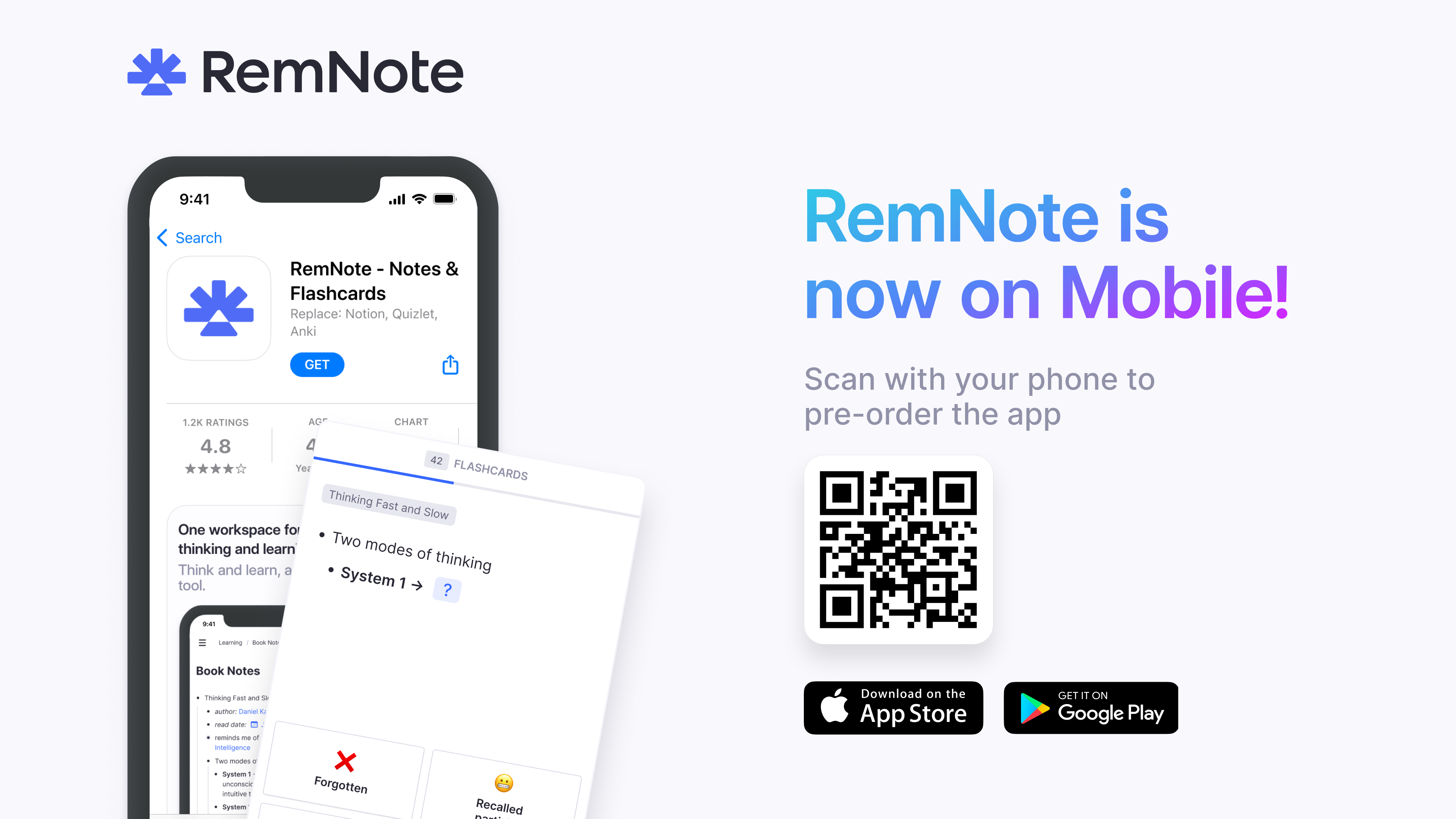
Bringing the product to mobile was the other big thrust — I led the design of the mobile app so RemNote's knowledge work could travel off the desktop.
Sweating the edge cases
Even after we released the stable redesigned version, we had a lot of bugs and rough corners, so I spent a great deal of time embedded with the engineering team crafting the details — deciding how edge cases and the rarely-used parts of the app should actually behave. That unglamorous work, resolving the parts most people never notice, is a lot of what separated the redesigned RemNote from the one I first walked into.
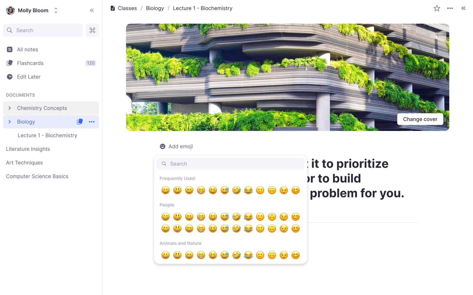
It also meant looking out for the smaller stuff: rich formatting like highlighted callouts, and the customization touches like cover images and emoji, that people enjoy in their note taking apps.